Photo to Architectural Model Poster
Turn any photo of a building into a dual-zone editorial poster: full photo on top, photoreal miniature museum model below. The precision prompt that avoids cartoon renders, tested on 6 building types.
@xiaoxiaodong01
Photo to Architectural Model Poster
Upload a photo of any building and get back a high-end editorial poster: the original photograph on top, and below it, the same structure rebuilt as a photorealistic collector's scale model on a white museum base. It looks like the kind of paired plate you'd find in an architecture monograph — and it works in one shot with Nano Banana (Gemini image generation).
This page contains the full working prompt, tested across six building types: a Gothic cathedral, a Chinese temple gate, Amsterdam canal houses, a Victorian glasshouse, a lighthouse, and a railway signal box. Along the way the original prompt was rebuilt into a "precision" variant, because the first version had a detail problem worth understanding.
The Original Formula
The viral version of this prompt (@xiaoxiaodong01, 182K views, 4.7K bookmarks) splits the canvas 50/50: the top preserves the photo with light art-magazine grading, the bottom "extracts the most identifiable subject" and rebuilds it as a minimalist isometric paper model with the palette distilled from the photo.
It's a genuinely good prompt architecture — the dual-zone layout and palette-extraction rules are what make the output feel designed instead of generated. But it has one clause that caps the quality ceiling:
"Do not mechanically replicate photo details; instead, re-express the subject through generalized block forms..."
That instruction is why the original produces soft, toy-like renders. We tested it as written and the model complied — too well. Rose windows became circles with radial strokes, tracery became grid lines, every building emerged as a cartoon of itself.
Why the Render Went Cartoonish
Three forces were at work:
- The prompt asked for it. "Generalized block forms" + "minimalist" + "quiet, restrained" is an explicit simplification order.
- It's a re-synthesis, not a crop. The model doesn't trace the photo into the lower half — it generates a new illustration conditioned on the photo, and that generation passes through its training prior for "isometric paper model," which is a clean craft-illustration aesthetic.
- The style anchor is a craft material. "Paper model" points at the model's prior for papercraft — flat colors, soft edges, no surface texture.
Each force has a counter-lever, and all three go into the precision prompt below.
The Precision Prompt
Tested and working on Nano Banana (Gemini 2.5 Flash Image) with photo attachment. This is the layered-layout version — the photo stays whole, and the model field overlaps its bottom edge like an angled museum panel. Copy it, attach your photo, and adjust the building-specific block.
Please create this uploaded photo into a standalone high-end design poster, no multi-image collages. Overall use 3:4 vertical composition with a layered, overlapping layout — NOT a hard 50/50 split.

LAYOUT: The original photo is shown in FULL at the top of the canvas, occupying roughly the upper 60%. Never crop, trim, or cut off any part of the original scene — if the aspect ratio does not match, extend the canvas sideways or upward with naturally continued sky and environment instead. The lower portion of the poster is a white editorial field that OVERLAYS the photo, rising over its bottom edge like an angled museum panel: the model display base and its white field visually overlap the lower band of the photo by about 10–15% of canvas height, creating a clean layered seam rather than a straight cut. No part of the photo's subject may be hidden behind the overlay — only empty foreground may be covered.

UPPER — THE PHOTO: Preserve the complete original photo: main structure, realistic texture, natural lighting and shadows, and original color atmosphere, with only subtle high-end photographic color grading to give it the quality of an art magazine, independent publication, or exhibition photography. Do not stretch, distort, or alter the main subject. Do not duplicate or repeat any element of the photo within the photo zone.

LOWER — THE OVERLAY MODEL: On the white overlay field, reconstruct the building as a museum-grade 1:500 architectural scale model of the kind displayed in architecture exhibitions — precision-crafted resin and etched-brass miniature, NOT a cartoon, NOT a paper craft, NOT a children's toy. This is a serious collector's display model with photographic realism: matte painted surfaces, physically accurate miniature lighting and cast shadows, and true-to-source geometry.

Preserve the defining features of THIS specific building with high fidelity, simplifying only where physically necessary for scale: [BUILDING-SPECIFIC FEATURE LIST — see adaptation table below]. Every major facade element must match the photograph exactly. Window openings must read as recessed voids with visible frames, never as flat line drawings.

The model sits on a clean white museum display base with a subtle shadow, surrounded by generous white space, conveying scale and solitude through volume contrast. No second focal point.

COLOR: Extracted entirely from the original photo above: [3–6 named colors, e.g. "honey-colored limestone, warm dusk-lit stone on lit faces, cool blue-grey on shadow faces, dark slate roof"]. Do not introduce colors unrelated to the original. Render with matte museum-model finish, fine surface texture, subtle ambient occlusion in recesses, and delicate cast shadows — absolutely no plastic sheen, no cel shading, no illustration outlines, no cartoonish exaggeration.

TEXT: A short English title distilled from the photo's theme or location, plus minimal numbering or tiny annotations. Keep text slender, restrained, and modern-editorial, arranged along the white space edges or the base line, forming a quiet typographic rhythm.

The overall result must feel like a photograph of an exquisite collector's architectural model, presented as a high-end editorial poster: precise, restrained, poetic, and collectible.
The Four Levers That Changed the Output
1. Swap the style anchor. "Museum-grade 1:500 scale model, resin and etched brass" instead of "paper model with generalized block forms." This is the single highest-impact change — it swaps the generation prior from craft illustration to product photography.
2. Write a preserve-list. Name the specific features that define the building — the illuminated clock face, the rose window tracery, the dougong brackets, the lattice gantry. Named features get retained; unnamed features get averaged into the model's prior.
3. Ban the cartoon register explicitly. "No cel shading, no illustration outlines, no plastic sheen" — negative style constraints that close off the illustration path the original prompt opens.
4. Invert the generalization clause. Replace "do not mechanically replicate details" with "simplify only where physically necessary for scale." Same intent, opposite behavior.
Adapting to Building Types
The [BUILDING-SPECIFIC FEATURE LIST] block is where the prompt engineering lives. What transfers per construction type:
| Building type | Feature list focus | Extra constraints |
|---|---|---|
| Stone church / temple | Clock face, rose window tracery, spire openwork, portal sculpture, bracket clusters, ridge figurines | "Bracket detail must read as three-dimensional relief, never as flat line drawings" |
| Row of houses | Each gable silhouette named individually, window mullion grids, date plaques | Force all houses onto ONE base; render water/canal as a matte recessed acrylic strip in the base |
| Glasshouse / conservatory | Iron mullion grid, ribbed dome, cornice cresting, interior silhouettes | Panes as "translucent recessed panels with subtle reflection — a few frosted, a few missing"; frame as 3D lattice with depth |
| Timber pub | Jettied overhang, 3D hanging sign, flower baskets, etched windows, window glow | "Window glow is warm backlighting behind translucent panes, not painted yellow rectangles" |
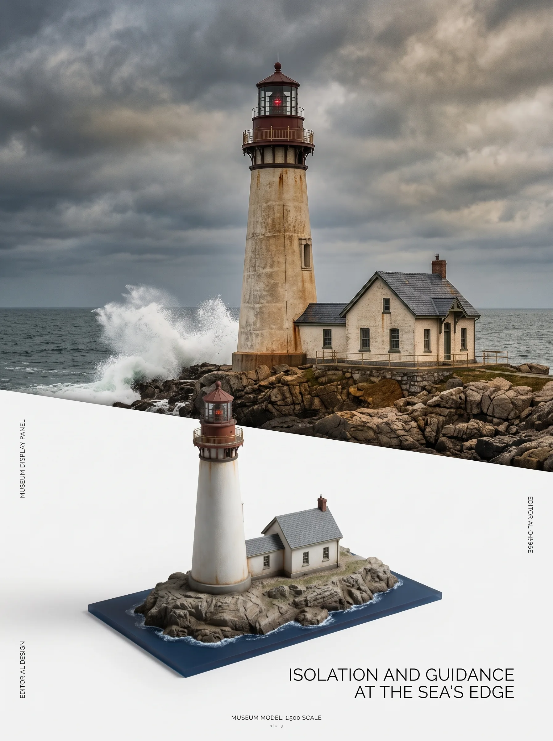
| Lighthouse | Conical taper, gallery railing, lantern room glazing, rocky terrain | "Never faceted, never blocky" for cylinders; rock outcrop REPLACES the flat plinth; sea as recessed acrylic strip |
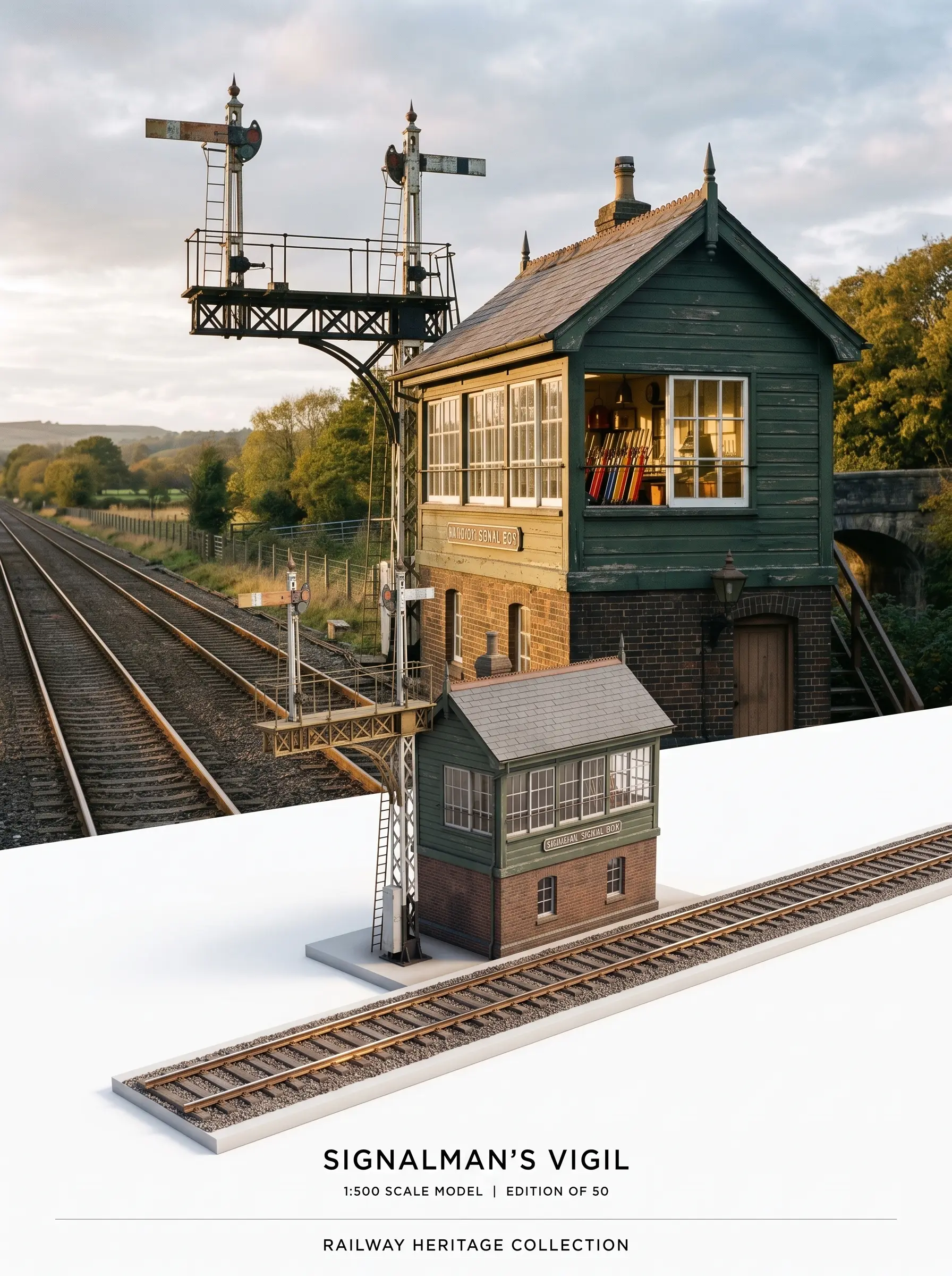
| Signal box / ironwork | Board-and-batten cladding, lever frame, lattice gantry, semaphore arms, rails | Thin elements priority: "lattice must read as three-dimensional etched-brass truss with visible depth between members" |
Two recurring tricks: terrain replaces the plinth (rock, canal, or track bed modeled into the base itself), and thin structures get an explicit depth requirement — without it, ironwork flattens into etched lines.
Results Across Six Building Types
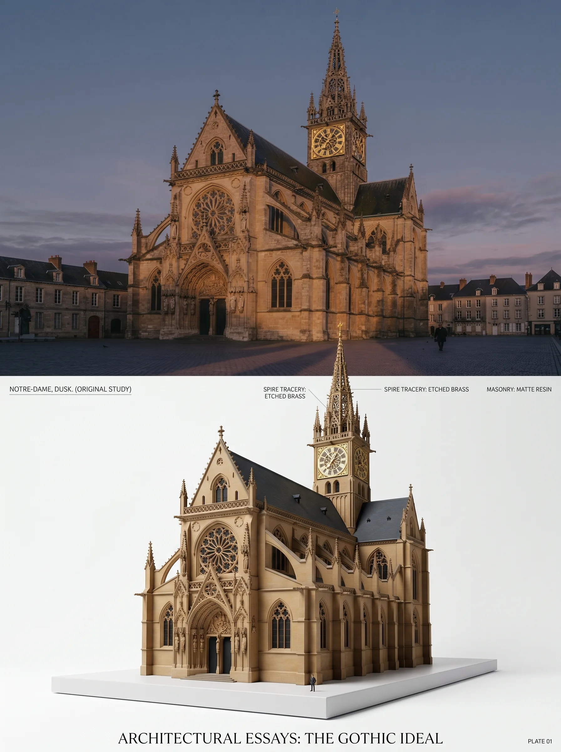
Gothic cathedral (Notre-Dame en Vaux, Châlons-en-Champagne) — the precision prompt's first full test. Rose window tracery, archivolts, buttresses, and the illuminated clock face all retained.
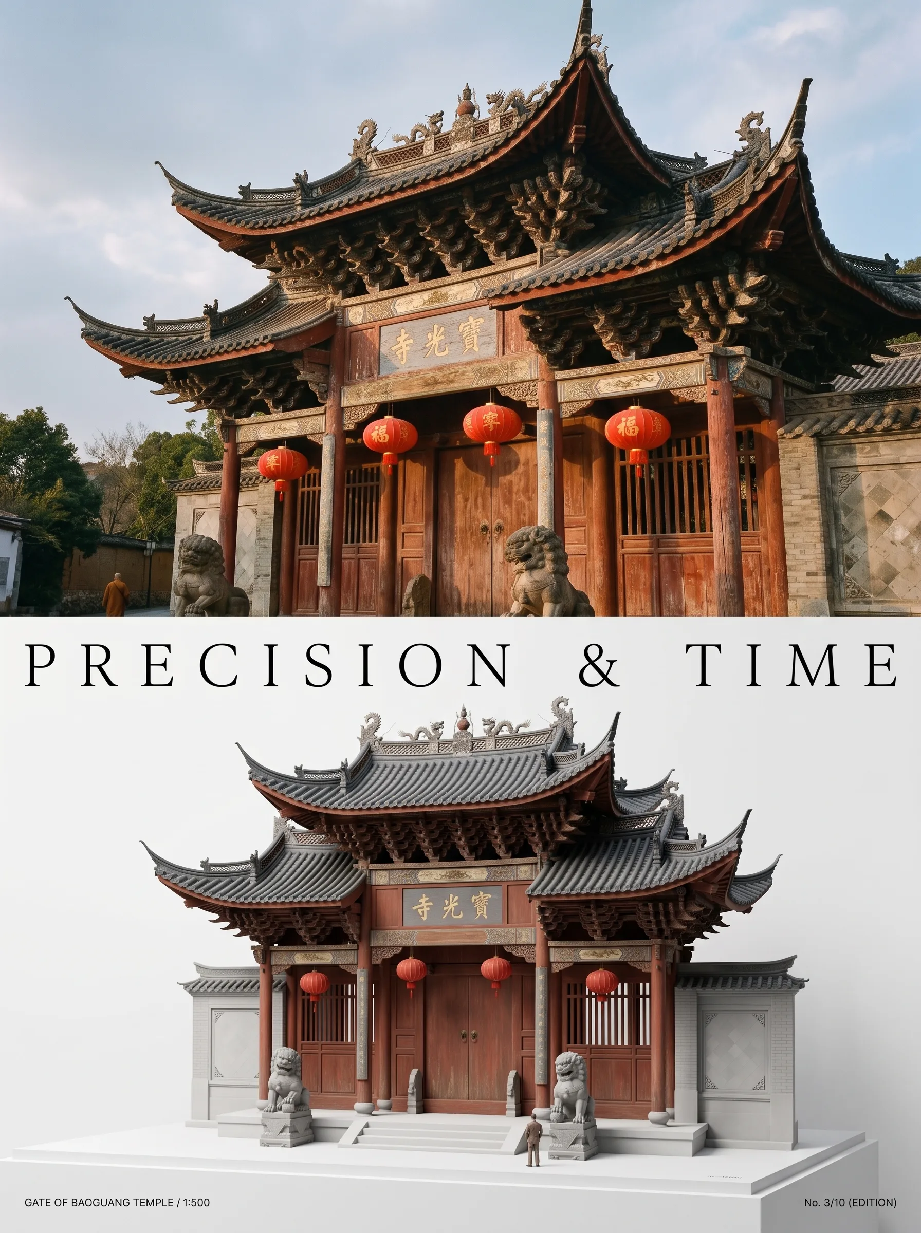
Temple gate (Baoguang Temple) — the hardest detail case. Dense dougong bracket clusters, curved roof profiles, ridge dragons, lanterns and stone lions all carried through; the plaque text 寺光寶 survived rendering.
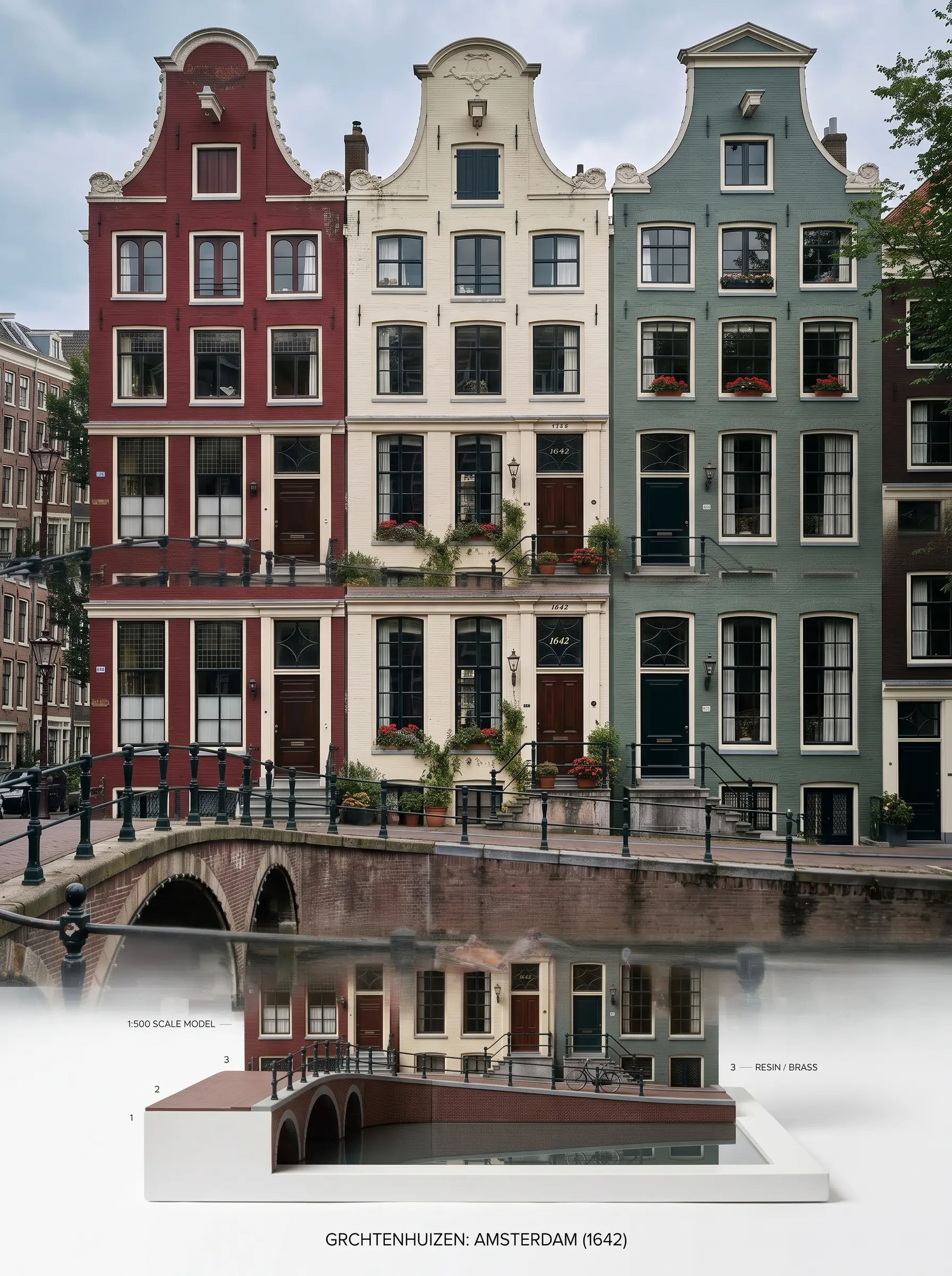
Amsterdam canal houses — three gable grammars on one base, canal as a recessed strip in the plinth.
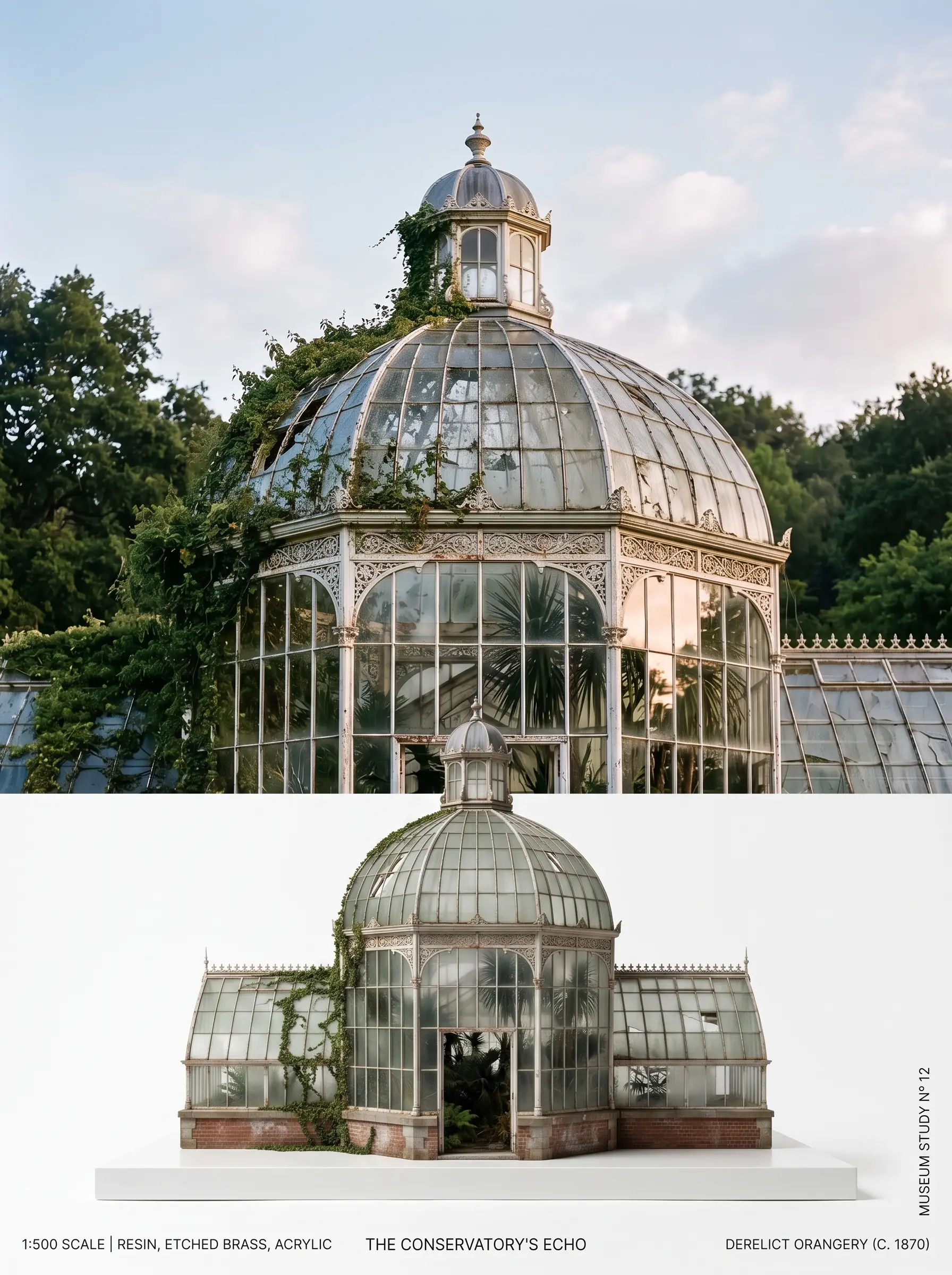
Victorian glasshouse — the transparency test. Ivy, aged panes, and the red brick base all survived; glass reads translucent rather than opaque.
Lighthouse — first run with the layered overlay layout and terrain-as-base. The seam reads as an angled museum panel; the rock outcrop replaces any plinth.
Railway signal box — the thin-structures test. Lattice gantry with visible depth, semaphore arms at distinct angles, rails running off the base edge.
Failure Modes (All Observed)
Every failure below happened in real runs. Each maps to a rule in the final prompt.
| Failure | Observed in | Fix in prompt |
|---|---|---|
| Cartoon/illustration rendering | Original prompt, all runs | Style anchor swap + explicit negative constraints (levers 1 and 3) |
| Long text garbles (GRCHTENHUIZEN → dropped syllable) | Canal houses run | Prefer short titles; retry without small text on complex surfaces if it persists |
| Photo element duplicated in upper band | Canal houses run | "Do not duplicate or repeat any element of the photo within the photo zone" |
| Photo cropped / subject cut off | Early runs | Layered layout: photo shown in FULL at ~60% height, overlay covers only empty foreground |
| Second focal point steals the model | Café run — a photoreal bicycle rendered on the model base | "No second focal point" + demote props explicitly ("barely-visible silhouette") |
| Flat glass / flat ironwork | Glasshouse, signal box | "Translucent recessed panels", "3D lattice with visible depth between members" |
| Cylinder taper goes blocky in isometric | Lighthouse (risk case) | "Never faceted, never blocky" named per feature |
Bonus Behavior: Landmark Identification
Across two independent runs, the model resolved the building's real-world identity from the photo alone and worked it into the poster's metadata — "NOTRE-DAME EN VAUX" with the correct city, and "GATE OF BAOGUANG TEMPLE / 1:500" read from the Chinese plaque 寺光寶. Generic buildings get invented archival metadata ("MINIATURE EST. 1950", "EDITION OF 50"), which fits the poster fiction anyway. If you need factual accuracy on the title, name the location in your prompt instead of trusting the model's read.
Prompting Checklist
- Attach a photo where one structure dominates — readable roofline, minimal clutter, strong warm/cool split. Flat landscapes and crowded scenes give the model nothing to extract.
- Name 3–6 palette colors explicitly; extraction without naming drifts.
- One building type per run; write the feature list like a museum curator's catalogue entry, not an adjective pile.
- If the render still softens, raise the stakes on the anchor: "hand-cut crystal glazing" and "museum-quality 3D-printed model" carry more detail priors than paper or resin.
For the original dual-zone formula this is built from, see @xiaoxiaodong01's post on X. For related transforms on this site, see 3D Glassmorphism Icon and the Image Generation overview.
Related Articles & Guides
 #gpt-image-2
GPT Image 2 Travel Photo to Fine-Art Poster Prompts
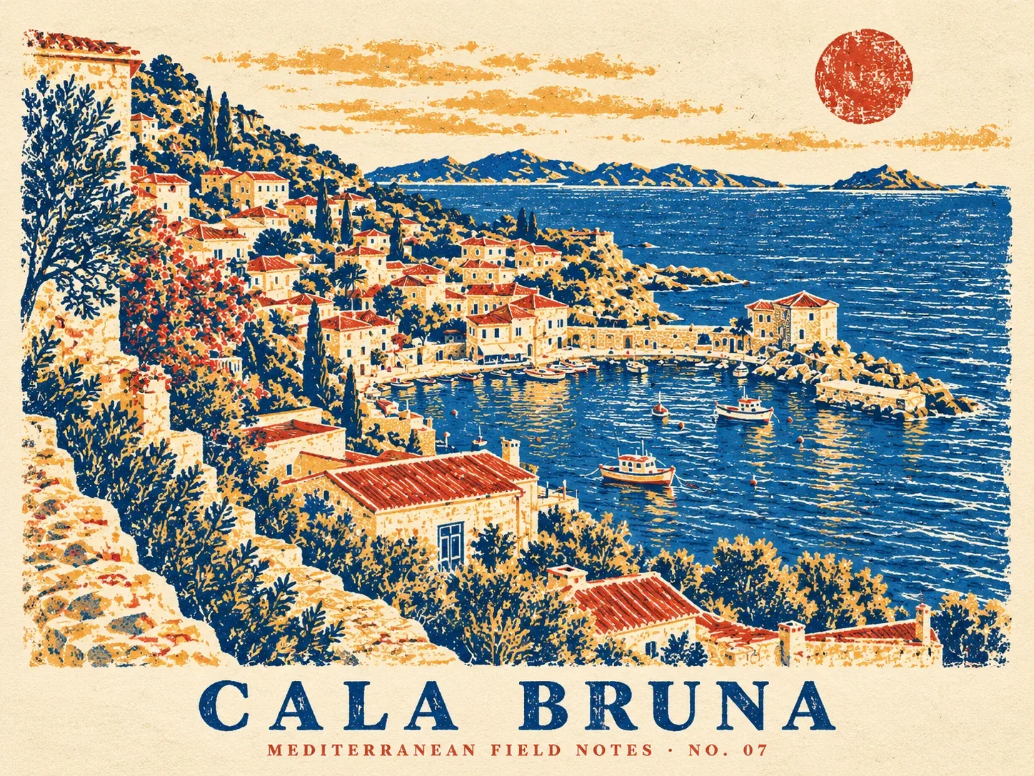
Use one travel photo as the reference for three GPT Image 2 poster styles: rubber stamp, architectural silkscreen, and impasto paint.
 #nano-banana
Artistic Transformation Prompts & Styles in Nano Banana
Turn photos into gallery art, anime scenes, oil paintings, and exhibition posters with Nano Banana. Master image-to-image style transfer prompt engineering.
 #nano-banana
Art Styles & Themes with Nano Banana
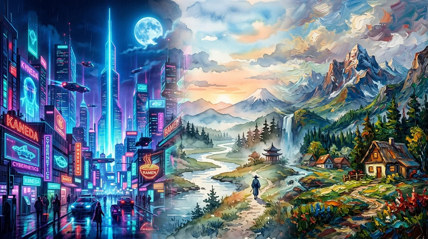
Generate and reimagine scenes in distinct art styles with Nano Banana, from cyberpunk neon cities to painterly and retro aesthetics.