GPT Image 2 Art Style and Media Prompts
Explore original GPT Image 2 art prompts for paper collage, oil pastel, sumi-e ink, felted wool, palette-knife oil, and botanical watercolor, with reusable techniques.
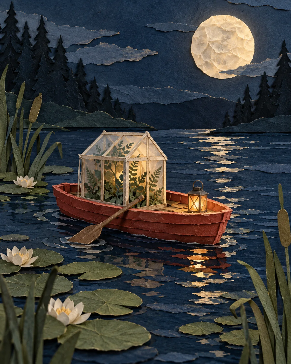
To steer GPT Image 2 toward a distinct art medium, describe how the image is made: its surface, mark-making, edges, palette, and composition. “Whimsical” or “painterly” gives a mood; torn paper, waxy pastel strokes, and diluted ink washes give the model a visual process to follow.
These six original prompts explore tactile cut-paper collage, a hand-drawn oil-pastel storybook, a restrained sumi-e landscape, needle-felted fiber art, palette-knife oil paint, and a botanical watercolor study. Each prompt works on its own and names both the medium cues to emphasize and the styles to avoid.
Three art directions
Layered cut-paper collage
The scene is designed around physical layers. Deckled edges, folded tabs, paper fibers, and cast shadows make the medium readable instead of leaving the result as a flat graphic.
Create a 4:5 vertical handmade 3D cut-paper collage illustration of a small red rowboat carrying a tiny glass greenhouse across a deep-blue pond at dusk. Build every element from visibly layered matte paper: torn cream deckled edges, painted paper shapes, folded tabs, tiny scored details, and soft cast shadows between stacked layers. In the boat, show miniature fern fronds and one glowing lantern; surround it with paper lily pads, simple reeds, and a large pale moon made from crumpled vellum. Use a restrained palette of midnight blue, warm ivory, muted coral, moss green, and a little amber. Compose it as a refined contemporary picture-book plate with a clear silhouette, tactile fibers, generous dark negative space, and careful craft rather than a flat vector graphic. The paper construction should be unmistakable at first glance. No photographic elements, no plastic or clay, no lettering, no border, no watermark, no collage grid.
Why it works: each layer has a material cue and a spatial relationship. The repeated paper language is reinforced by visible edge shadows, while the limited palette keeps the small scene legible.
Oil-pastel storybook
This prompt makes the character and mark-making the focus. Broad strokes and a small palette provide a hand-drawn look, while clean facial features prevent texture from obscuring the subject.
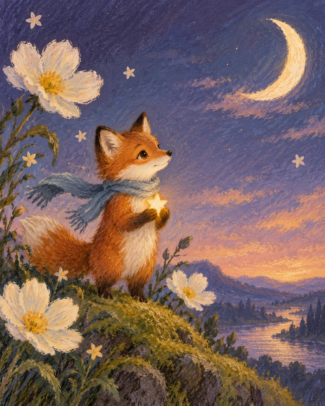
Create a 4:5 vertical traditional storybook illustration in oil pastel and colored pencil. Show a small russet fox wearing a soft blue scarf, standing on a mossy hill at twilight and gently holding a tiny fallen star cupped in its paws; a crescent moon and a few oversized wildflowers frame the scene. Use broad confident pastel strokes, softly layered colored-pencil hatching, gentle handmade edges, and visible paper tooth. Keep the fox's face clean and readable, with expressive but natural eyes and simple shapes. Build a strong silhouette and a few large color masses in a limited palette of russet, dusty blue, butter yellow, cream, and deep plum. Let one decorative motif—small star-shaped flowers—repeat sparsely in the background, leaving generous calm negative space. Warm nostalgic picture-book mood, clearly hand-drawn and painterly, not a 3D render or a photograph. No typography, no lettering, no border, no watermark, no messy pigment over the face, no dense decorative fill.
Why it works: the prompt distinguishes texture on the paper and background from the clean face. A clear silhouette, limited colors, and one recurring motif keep the illustration from becoming overdecorated.
Sumi-e ink landscape
Ink paintings rely as much on unpainted paper as on the brush marks. This prompt reserves open space for mist and water, and uses a few different ink weights to separate the heron, reeds, and distant hills.
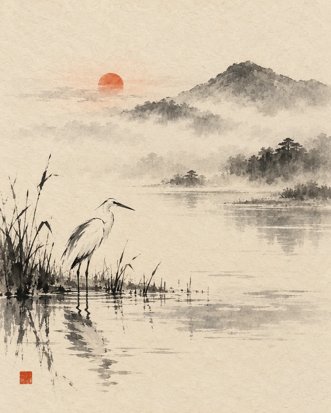
Create a 4:5 vertical Japanese sumi-e ink painting on warm ivory washi paper. Show a solitary white heron standing among a few dark reeds at the edge of a still pond; a distant low mountain and a small red-orange sun dissolve into pale mist. Use expressive black ink brushwork with varied pressure: one confident dry-brush stroke for the bird's back, soft diluted washes for water and fog, and sparse fine lines for reeds. Preserve large areas of untouched paper as negative space. Keep the composition calm and asymmetrical, with the heron low and slightly left of center and a restrained reflection broken by a few ripples. Add a single small vermilion square seal-like mark with no legible characters. Traditional hand-painted ink texture, visible paper fibers, restrained pigment, no gradients that look digital, no anime outlines, no photorealism, no extra calligraphy or text, no border, no watermark.
Why it works: the prompt assigns a different brush behavior to foreground, water, and distant forms. Negative space carries the atmosphere, so the short list of marks stays intentional.
Craft and pigment directions
Three more materials extend the same structure into sculpture, oil paint, and botanical watercolor. As before, the medium is named first; the scene exists to demonstrate it.
Needle-felted wool miniature
Fiber art succeeds when every element is assigned a specific wool behavior: bouclé loops for vegetation, wrapped yarn for water, embroidered stitches for windows. The prompt also asks for a straight-on set-photo presentation so contact shadows and fibers stay visible.
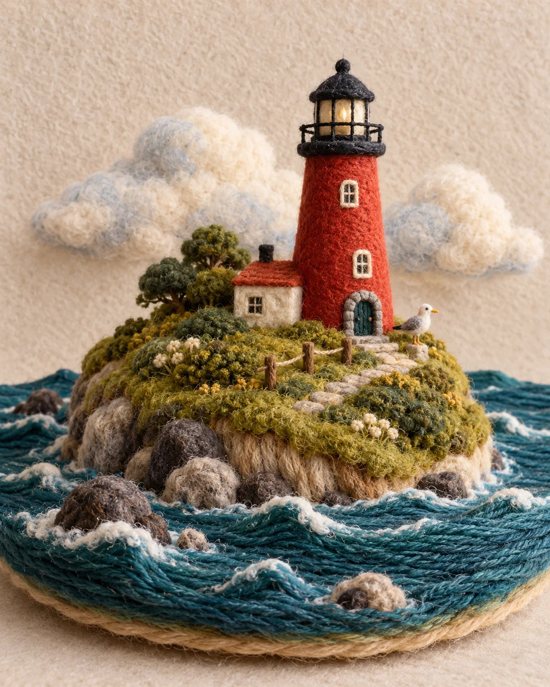
Create a 4:5 vertical needle-felted wool miniature artwork of a tiny red lighthouse perched on a rounded island in a deep teal sea. Construct the entire scene from tactile fiber materials: fuzzy merino wool clouds, looped bouclé grass, tightly wrapped yarn water, embroidered cream window stitches, and soft felt rocks. A small wool gull rests near the lighthouse door. Make the water visibly formed from parallel strands of yarn with a few raised felt wave ridges; let the island edge show a clean layered cross-section of wool fibers. Use a limited palette of deep teal, warm cream, rust red, moss green, and muted sky blue. Photograph the handmade miniature straight-on against a simple warm oatmeal felt backdrop, with soft side light and gentle contact shadows revealing the fibers. It should feel like carefully needle-felted stop-motion set art, charming and finely crafted, not a digital illustration. No photographic landscape, no plastic, no clay, no lettering, no labels, no border, no watermark, no split-screen.
Why it works: each region gets its own material technique instead of one generic “cozy craft” adjective. Naming the photographic setup (backdrop, side light, contact shadows) is what keeps it reading as a real handmade object.
Impasto oil painting
Here the paint itself is the subject. The prompt dictates where the pigment sits thick, where it is scraped thin, and which shapes stay decisive, so the surface behaves like palette-knife oil rather than a smoothed digital render.
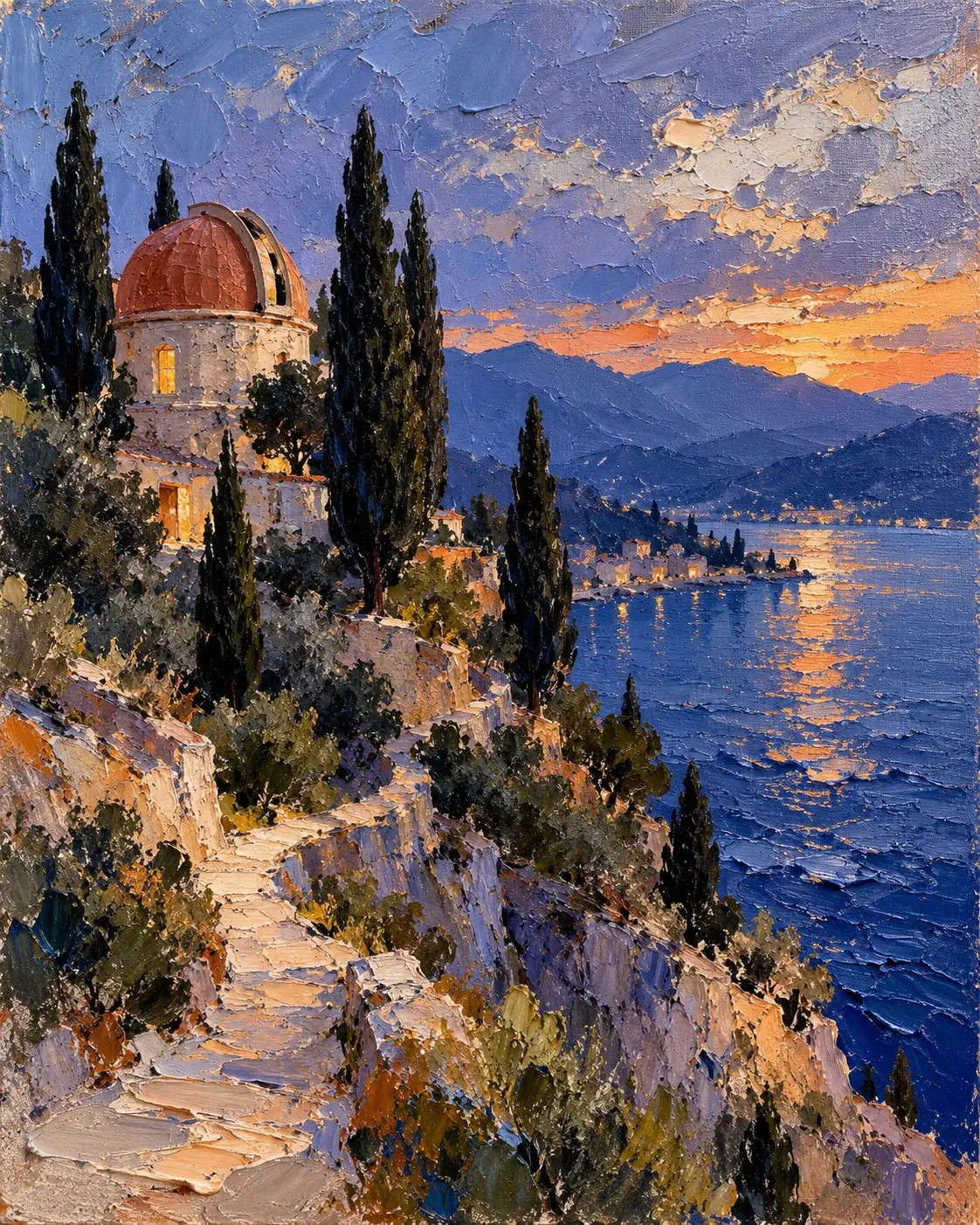
Create a 4:5 vertical fine-art impasto oil painting of a small hillside observatory above a cobalt lake at blue hour. A warm terracotta observatory dome sits among dark cypress trees; a narrow pale path curves down toward the water, where a few broken strokes reflect the last apricot light. Paint the whole scene with heavy-body oil and palette knife: thick raised ridges for the lake, broken impasto strokes in the sky, visible knife-scraped edges along the path, and layered pigment catching light at different heights. Let the cypress silhouettes be decisive dark shapes against a muted lavender-blue sky. Use a disciplined palette of ultramarine, dusty lavender, terracotta, muted apricot, and warm ivory. Make it a tactile gallery painting on linen canvas with visible weave at the margins, expressive but controlled composition, clearly painted rather than photographic. No smooth digital gradients, no airbrushed surfaces, no thin watercolor washes, no text, no signature, no frame, no watermark.
Why it works: each part of the landscape is assigned a paint-handling rule — ridges, broken strokes, scraped edges — instead of a vague “textured painting” request. The negative list targets the two cheapest failure modes: digital gradients and airbrushed color.
Botanical watercolor study
Watercolor needs both control and surrender. Fine ink drafting defines the greenhouse, while washes are allowed to pool, granulate, and bleed for the foliage, and untouched paper provides the light.
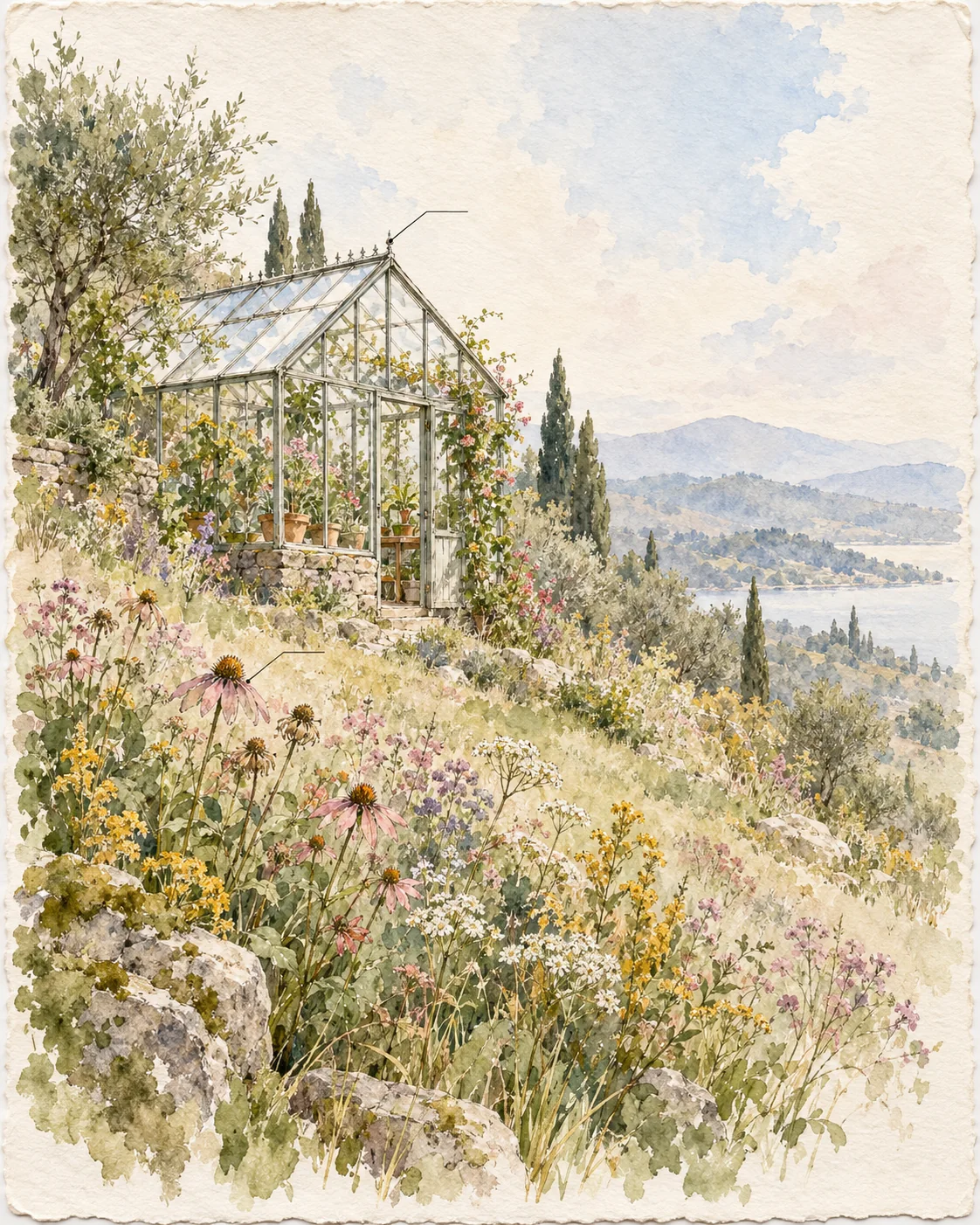
Create a 4:5 vertical botanical watercolor study of a small glass greenhouse surrounded by wildflowers on a soft hillside. Paint on warm cotton watercolor paper with visible deckled edges. Use transparent layered washes in sage green, dusty rose, ochre, and pale sky blue; let colors bloom and bleed at their edges with visible granulation in the darker shadows. Keep crisp fine-ink line work on the greenhouse frame, panes, and a few flower stems, mixing precise drafting with loose wet-on-wet foliage. Leave generous unpainted paper as light and haze, especially around the roof glass and sky. Add small study annotations as thin unlabeled leaders pointing at the roof ridge and one flowerhead, with no words. Make it feel like a page from a naturalist's field journal, delicate and observational, not a poster or digital art. No photorealism, no heavy opaque gouache coverage, no airbrush gradients, no lettering, no signature, no border, no watermark.
Why it works: the prompt pairs two techniques that fight each other in most outputs — precise ink lines and loose washes — and assigns each a specific territory. Unlabeled leader lines evoke the study format without risking garbled generated text.
A reusable art-medium recipe
For another style, replace the medium-specific details while keeping the same prompt structure:
- Name the medium and support: cut paper, felt, oil on canvas, or ink wash on washi.
- Describe the marks: torn edges, broad strokes, hatching, dry brush, diluted wash, palette-knife ridges.
- Choose a palette: limit dominant colors and reserve accents for focal points.
- Set the composition: specify silhouette, focal placement, and negative space.
- Decide how it is seen: a photograph of the object or a flat artwork on its surface.
- Exclude conflicting media: ask for no photography, 3D render, or digital gradients when those would undermine the chosen look.
The prompts and images here were created independently for PromptGenius. The art directions were informed by Eren Özgür’s layered paper-collage prompt, FufuCreates’ oil-pastel picture-book template, FufuCreates’ sumi-e character conversion prompt, Hamburgerai’s felted wool miniature poster, and DAAI’s structural evolution poster for the impasto and watercolor tiers. For applied graphic design, see composition reference cards and the travel-photo poster workflow; browse the GPT Image 2 collection for the full set.
Related Articles & Guides
 #gpt-image-2
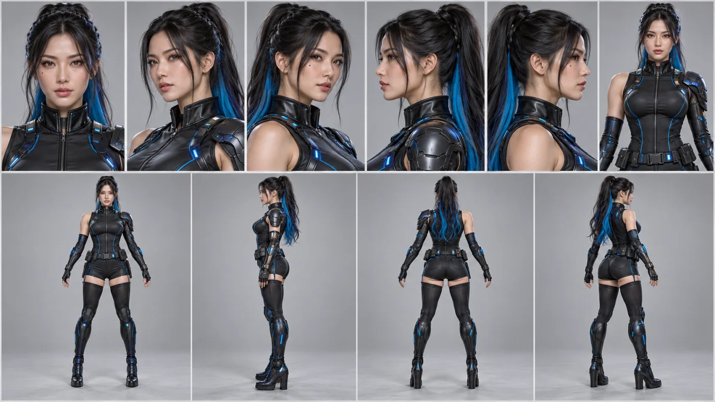
GPT Image 2 Character Sheet and Reference Prompts
Keep a recurring character consistent in GPT Image 2 with casting sheets, expression grids, pose studies, and reusable hair and wardrobe cards.
 #gpt-image-2
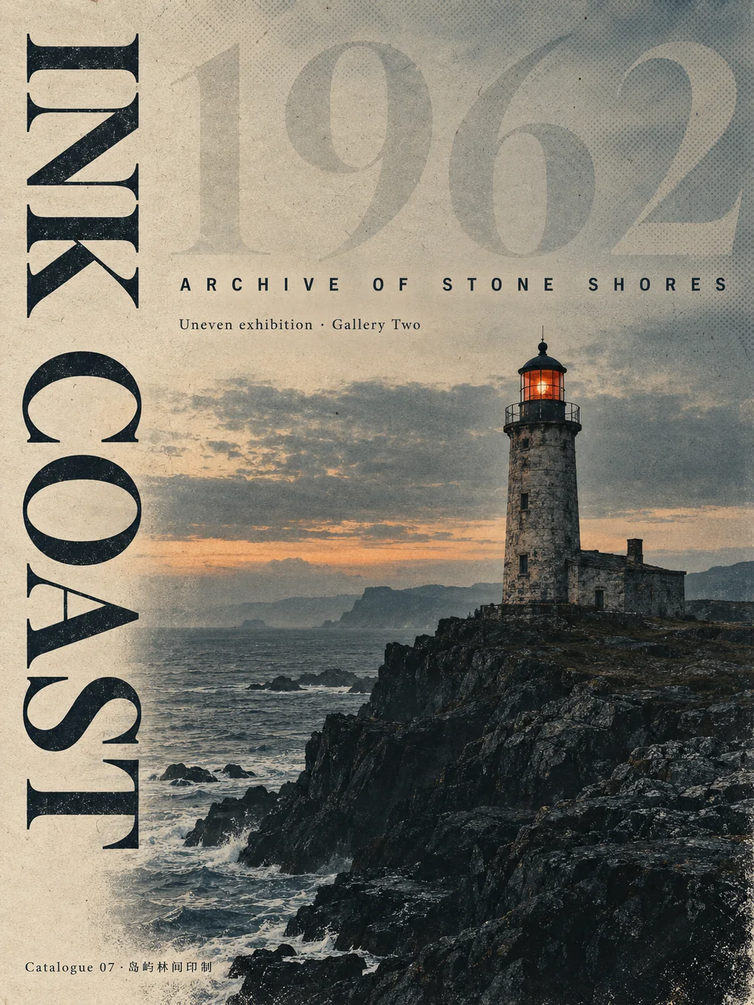
GPT Image 2 Typography Poster Prompts
Create GPT Image 2 posters with real rendered text — letterform grounds, Swiss grids, archival hierarchy, signage, covers, and event key art.
 #gpt-image-2
GPT Image 2 Photorealism Prompt Guide
Create more believable GPT Image 2 photos with concrete camera, lighting, material, framing, and imperfection cues instead of generic realism keywords.