GPT Image 2 UI Mockup Prompts
Create concept UI screens with GPT Image 2 using explicit layout, design tokens, concise labels, and consistent components.
GPT Image 2 can help visualize interface directions before you build them. These prompts create concept screens for a fictional travel-planning product, WAYMARK, with a shared palette and repeated labels across mobile and desktop layouts.
The examples are visual mockups, not production-ready interfaces. Generated text, maps, and controls need design and engineering review before use in a shipped product.
Three screens for one travel app
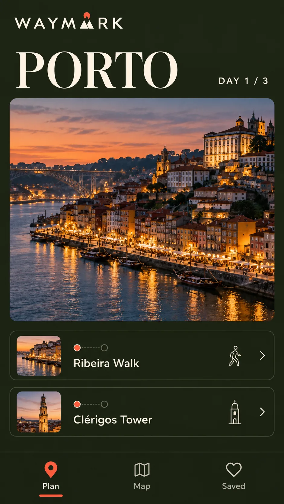
Mobile itinerary
This prompt defines the canvas, visual tokens, screen hierarchy, and exact interface labels. Keeping the content list short leaves room for the model to render the screen cleanly.
Create a complete 9:16 portrait mobile-app screenshot for WAYMARK, a premium travel journal. The image is the interface itself, viewed straight on; do not show a phone frame, hand, or browser chrome. Use a dark midnight-olive background, warm ivory typography, and one vivid persimmon accent. Pair elegant editorial serif typography for the place name with a precise modern sans-serif for controls. At the top, show the wordmark “WAYMARK”, the large title “PORTO”, and a small “DAY 1 / 3” marker. Make a cinematic dusk photograph of Porto’s Douro riverfront the dominant image, with deep blue shadows and subtle film grain. Under it, place two refined itinerary rows labeled “Ribeira Walk” and “Clérigos Tower”, each with a small time marker and minimal line icon. Finish with a quiet bottom navigation labeled “Plan”, “Map”, and “Saved”. Use a clear grid, generous spacing, carefully cropped photography, and excellent contrast. Print only the specified interface text; no extra copy, fake logos, device frame, or perspective.
Desktop route dashboard
The desktop prompt allocates separate areas to navigation, the map, and the itinerary. It repeats WAYMARK’s design tokens and place names to make this screen feel like part of the same product concept.
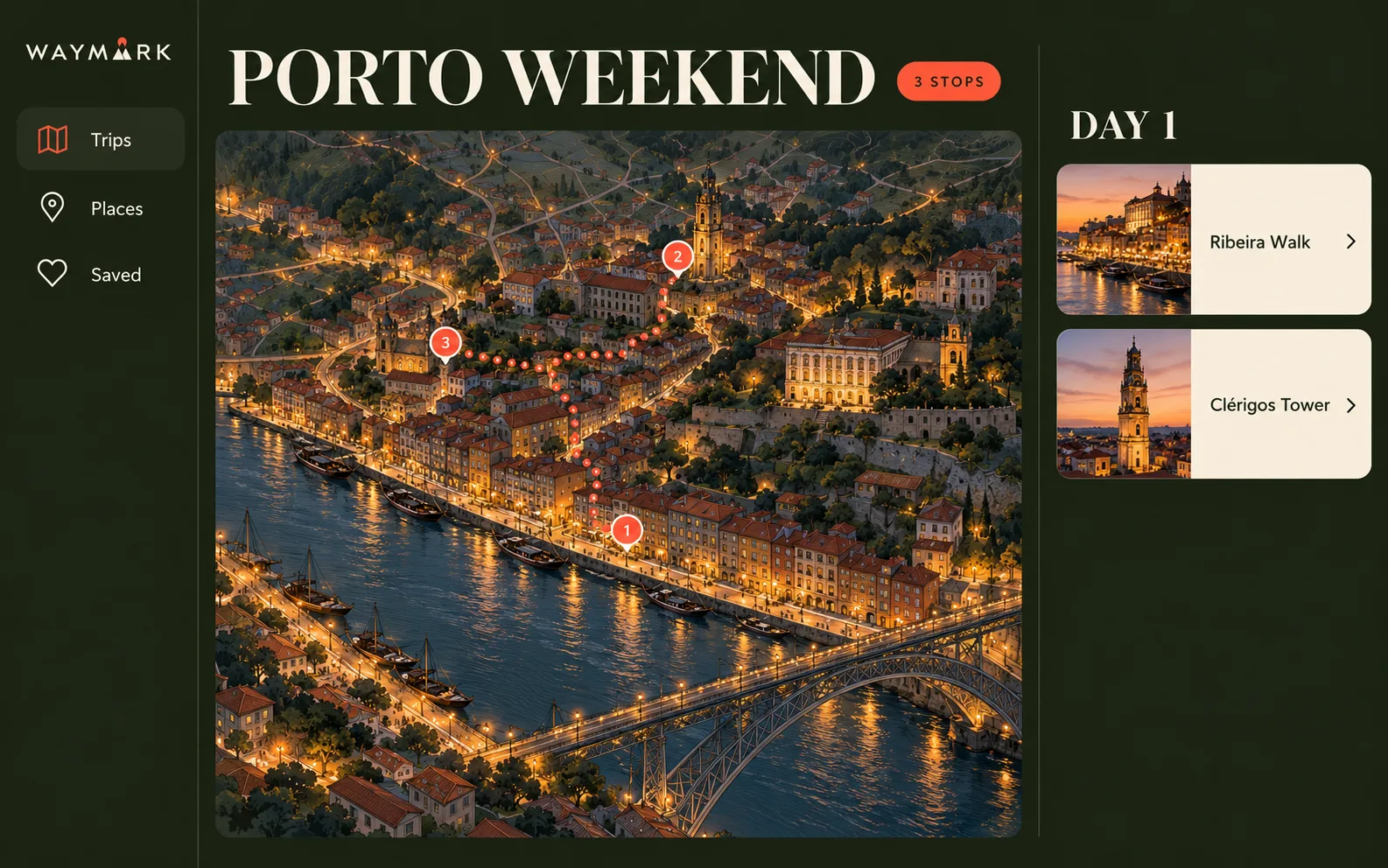
Create a complete 16:10 desktop web-app screenshot for WAYMARK, a premium travel journal and trip planner. The image itself is the interface, viewed straight on; no monitor frame, browser chrome, or perspective. Use a sophisticated dark-olive canvas with warm ivory panels, persimmon route markers, delicate map linework, editorial serif page title, and crisp sans-serif controls. Layout: a narrow left navigation rail with the wordmark “WAYMARK” and the labels “Trips”, “Places”, “Saved”; a main header “PORTO WEEKEND”; a large central illustrated map of Porto with the Douro River, a dotted walking route, and three numbered markers; a right itinerary panel headed “DAY 1” with two cards, “Ribeira Walk” and “Clérigos Tower”; a small chip “3 STOPS”. Use a refined map illustration with topographic texture and muted warm lights, not a generic white road map. Keep the information hierarchy clean, text readable, and interface spacing premium. No extra labels, no fake logos, no device frame.
Place detail
This screen uses the same palette and navigation, but shifts emphasis to a single destination photo and two clear actions.
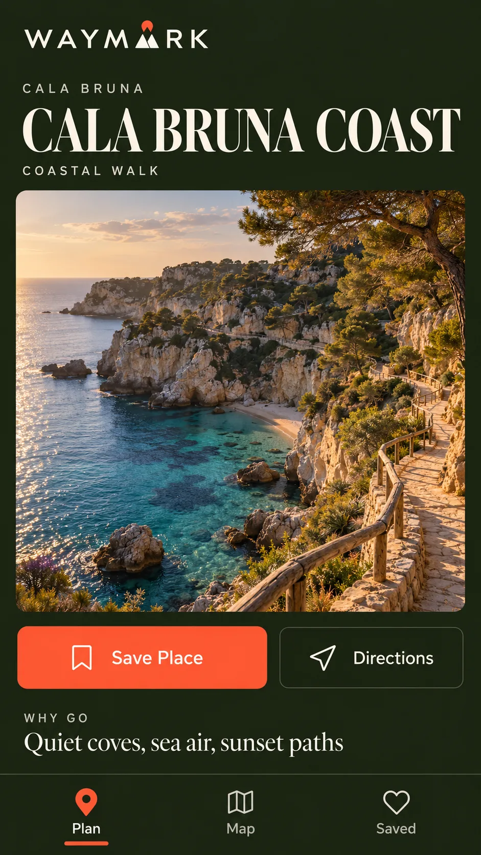
Create a complete 9:16 portrait mobile-app screenshot for WAYMARK, a premium travel journal. The image itself is the interface, viewed straight on; no phone frame, hand, or browser chrome. Use the WAYMARK design system: deep midnight-olive background, warm ivory typography, persimmon accent, elegant editorial serif for the destination name, crisp modern sans-serif for controls. The destination is fictional: “CALA BRUNA COAST”. At the top, show the wordmark “WAYMARK”, a small location label “CALA BRUNA”, the large title “CALA BRUNA COAST”, and the category “COASTAL WALK”. Make a full-width cinematic photograph of a secluded Mediterranean cove with pale stone cliffs, clear blue-green water, and a winding coastal path the visual focus. Below the photo, include one persimmon button “Save Place”, a secondary “Directions” action, and a compact “WHY GO” line: “Quiet coves, sea air, sunset paths”. Finish with a refined bottom navigation: “Plan”, “Map”, “Saved”. Use generous spacing, excellent contrast, art-directed photography, and a premium travel-magazine feel. No distances or other facts, no extra text, no fake logos.
Prompting checklist
- Fix the canvas first: specify mobile or desktop and give the aspect ratio.
- Name the design system: set the palette, type style, spacing, and corner treatment.
- Describe the layout by region: tell the model what belongs in the header, navigation, main area, and side panel.
- Keep interface copy concise: quote exact labels and limit the amount of small text.
- Inspect the result as a mockup: check hierarchy and layout, then correct inaccurate text or controls in a design tool.
The GPT Image 2 prompt repository awesome-gpt-image-2 includes a broad UI/interface prompt category. These WAYMARK screens and prompts are original examples made for this page.
Related Articles & Guides
 #gpt-image-2
GPT Image 2 Prompts and Workflows
Explore original GPT Image 2 prompts with generated examples for posters, art styles, composition studies, interface mockups, infographics, and photorealism.
 #gpt-image-2
GPT Image 2 Composition Reference Card Prompts
Generate four minimalist composition studies with GPT Image 2: visual core, diagonal momentum, enclosing axis, and sectional partition.
 #gpt-image-2
GPT Image 2 Infographic and Diagram Prompts
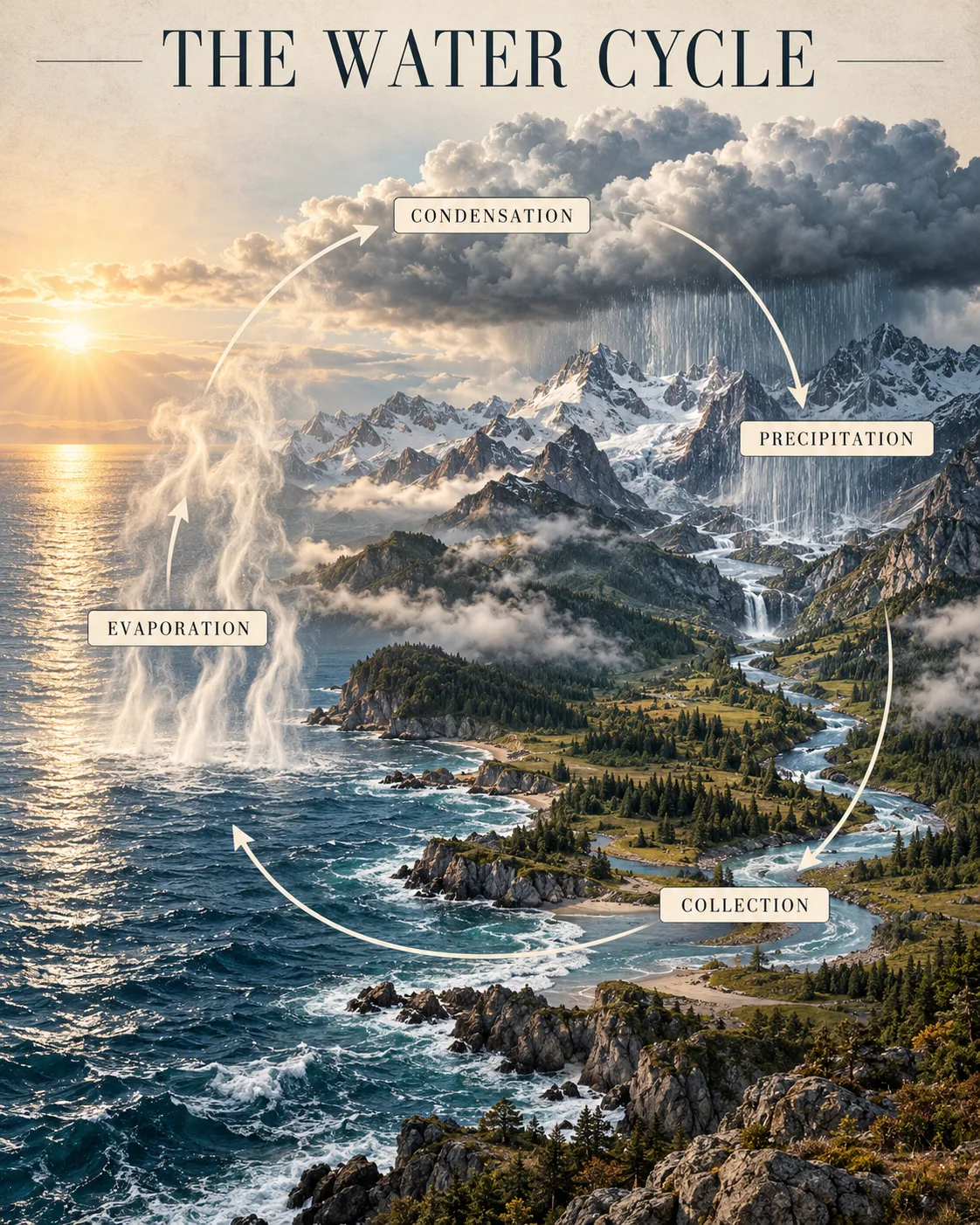
Build readable GPT Image 2 infographics with clear sequences, short labels, verified facts, and layouts that make relationships easy to scan.