GPT Image 2 Typography Poster Prompts
Create GPT Image 2 posters with real rendered text — letterform grounds, Swiss grids, archival hierarchy, signage, covers, and event key art.
GPT Image 2 is one of the strongest models at rendering readable text inside an image, which makes poster typography a practical use case rather than a novelty. The reliable pattern is small and strict: name every text string in quotes, give each one a typographic job, and forbid everything else.
Each prompt is self-contained: no reference image or chat history is needed, so you can paste it into a fresh session and swap the quoted copy. The four poster prompts cover promotional formats, and three more apply the same structure to type-led design systems, signage, and publishing.
Four poster formats
Letterform ground ensemble
The environment itself becomes the title: giant letterforms are painted onto the plaza pavement the characters stand on. Describing the ground as monumental road typography keeps the text physical instead of floating as a caption layer.
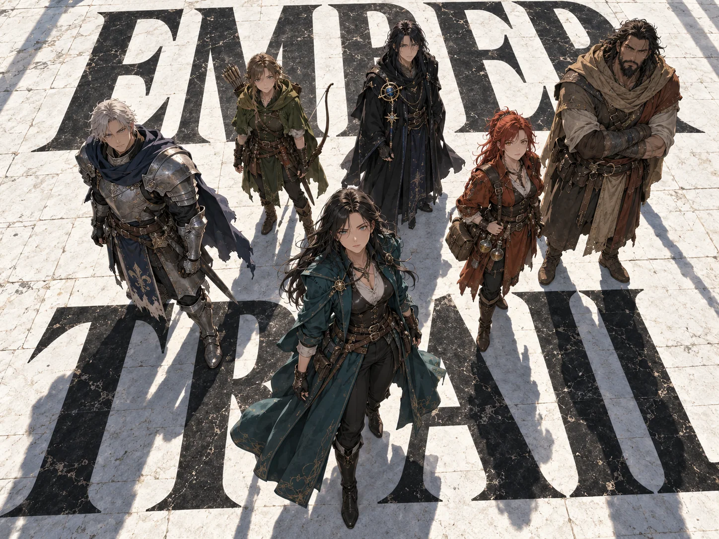
Create a 4:3 landscape cinematic poster of six fully clothed fictional fantasy adventurers standing in loose formation on a vast white typography ground, photographed from a high overhead angle with strong spatial depth. The leader stands front-center in a deep teal traveling coat with a dramatic flowing hem; behind her, in staggered rows: a gray-haired knight in slate plate armor, a young archer in moss green, a tall mage in ink-black robes with a small constellation ornament, a red-haired alchemist in rust leather, and a quiet giant in umber wrapping cloth. Costumes emphasize layered fabric, worn metal clasps, belts, and subtle battle wear; poses are frozen mid-moment, restrained, no smiles, eyes angled near the camera. The ground is white plaza pavement merged seamlessly with giant black letterforms spelling "EMBER TRAIL" that stretch in extreme perspective beneath their feet, like monumental road typography. Near-noon hard directional light casts razor-sharp shadows; premium anime key-visual quality with crisp lineart and film-poster compositional discipline. Render the title text exactly as "EMBER TRAIL" once in large matte black letters integrated into the pavement typography, correctly spelled. No other text anywhere, no logos, no watermark, no borders, no extra characters, no photobashing collage.
Why it works: the title gets exactly one quoted appearance and one physical job — pavement. Casting each character in a different color keeps six figures readable while the high-noon light keeps the ground type graphic.
Cultural-archive hierarchy
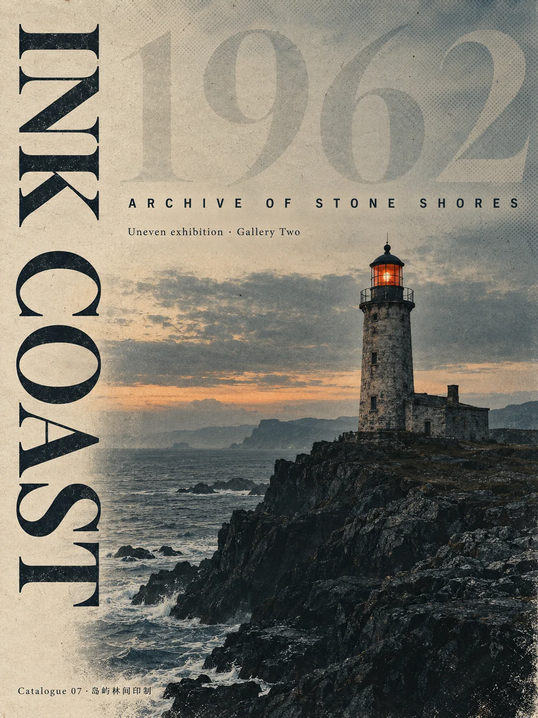
This format treats type as a five-tier system: a vertical serif title, an oversized translucent numeral behind the scene, a letter-spaced sans subtitle, a curatorial metadata line, and a micro publication line. Every tier is specified verbatim so nothing is left for the model to invent.
Create a 3:4 vertical contemporary cultural-archive exhibition poster centered on an old stone lighthouse on a rugged northern coastline at dusk. Style: a quiet architectural archive/exhibition publication cover. Treatment: desaturate the scene, compress midtones, strengthen the dark masses of the headland, and use a restrained offset-print palette of slate teal-black, ink blue-black, warm aged paper, ochre, with one small vermilion accent on the lighthouse lantern. Add subtle paper fiber texture, faint print grain, and gentle halftone dots in the sky. Typography hierarchy, all correctly spelled and rendered as exactly the following five text items and no others: 1) a large vertical title in a high-contrast serif reading "INK COAST"; 2) an oversized translucent background numeral "1962" behind the sky; 3) an uppercase letter-spaced sans-serif subtitle "ARCHIVE OF STONE SHORES"; 4) a small curatorial metadata line "Uneven exhibition · Gallery Two"; 5) a micro publication line at the bottom "Catalogue 07 ·岛屿林间印制". Render all text correctly spelled with crisp editorial letterforms, the vertical title fully legible. Restrained Swiss-archival layout, generous margins, quiet asymmetric balance. No other text, no logos, no signatures, no fake dates beyond 1962, no collage of many images, no heavy frames, no neon, no cartoon treatment.
Why it works: numbered text items behave like a spec sheet — the model renders five strings instead of choosing its own layout. Keeping the only non-Latin glyphs in the smallest line limits how much text the model can garble.
Magazine-cover brand frame
The typographic frame is prepended to a photo brief: reserve sky for the masthead, place the wordmark in one corner, and cap the cover at two strings. Composition rules about the subject and the reserved band do most of the layout work.
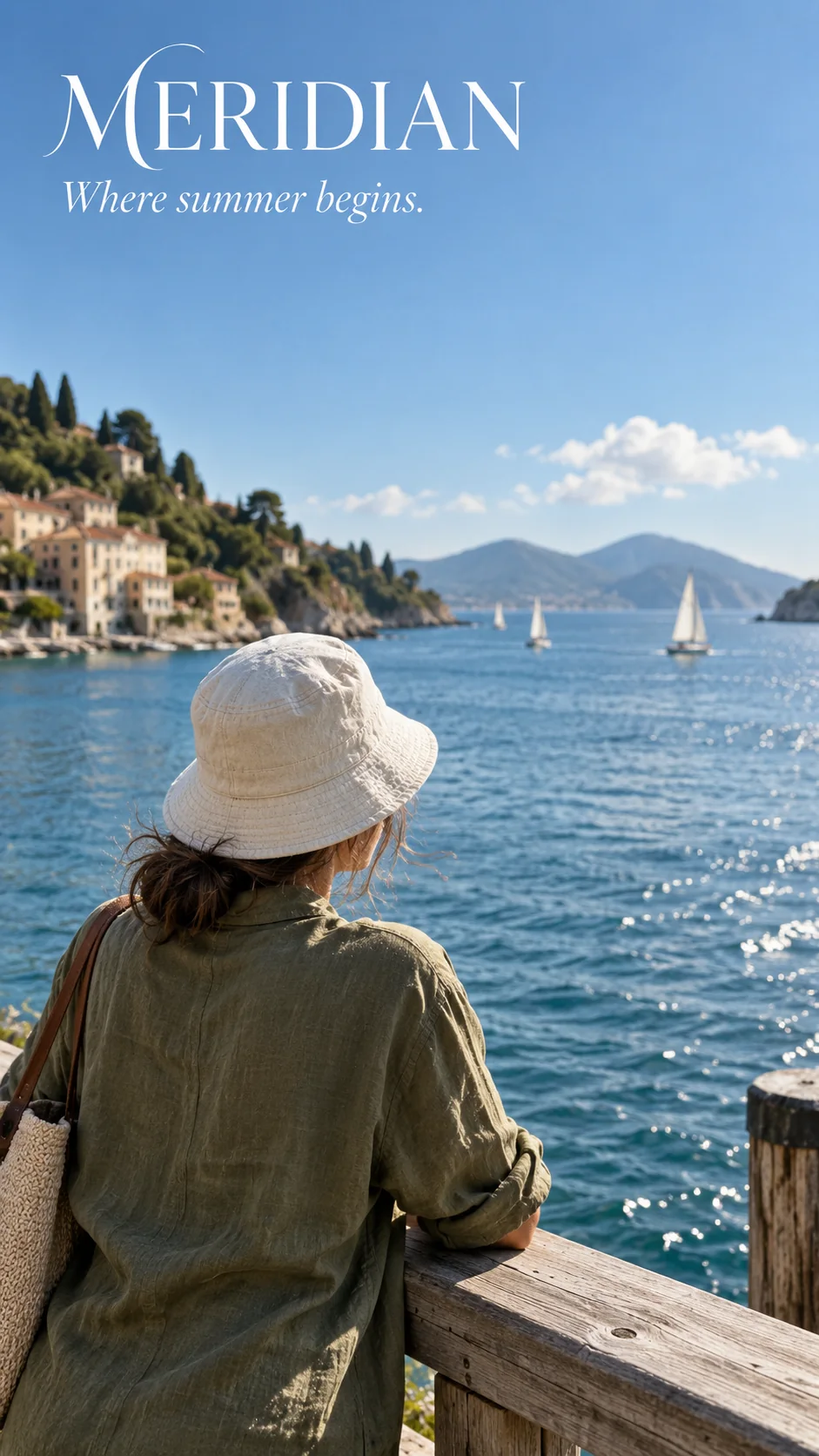
Create a 9:16 vertical travel-magazine cover built from a candid seaside photograph with typography laid over it. The photo: an adult traveler in a cream bucket hat and olive linen jacket standing at a wooden dock rail, gazing at a bright bay with a few distant white sailboats, morning light, relaxed posture shot from slightly behind and above the shoulder so the scene reads like a real unposed cover photograph. Composition rules: reserve a calm band of clear sky at the top of the frame for the masthead, position the subject low and off-center, keep blue-white tones clean and bright with a low-key quiet-luxury mood. Masthead text: render exactly the wordmark "MERIDIAN" once, in a refined white high-end serif, small handwritten-style flourish, in the upper-left corner, correctly spelled and crisply legible. Below it one tagline in italic serif reading "Where summer begins." Render those two text items and only those. Natural bright daylight, soft side light, realistic skin and fabric texture, shallow depth of field. No other text anywhere, no page numbers, no barcodes, no headline stacks, no logos, no watermark, no borders.
Why it works: “those two text items and only those” plus the banned-elements list (page numbers, barcodes, headline stacks) removes the cover clutter models add by default. The shot-from-behind framing keeps the photo cover-natural without needing a reference image.
Event key-art poster
Festival posters need a stacked title plus supporting lines. This brief separates the four blocks — title, date, subtitle, wordmark — and asks for a thumbnail-legible title, which is the actual acceptance test for event key art.
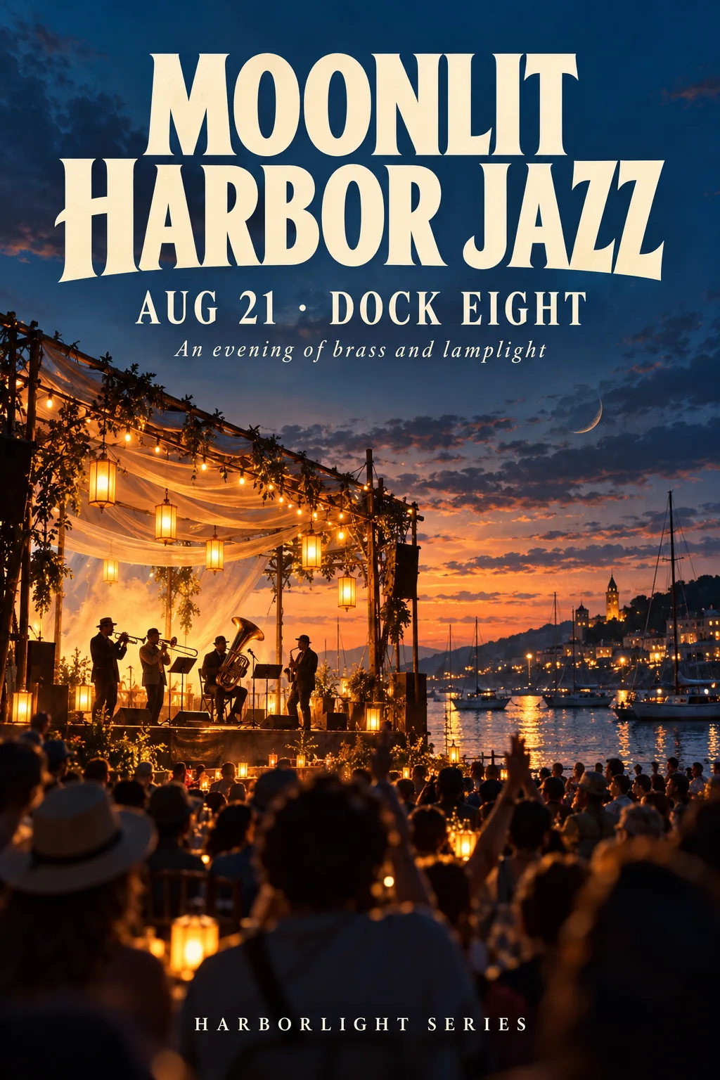
Create a 2:3 vertical music-festival key-art poster for a fictional late-summer evening event by the water. Scene: an open-air harbor stage seen from the back of the crowd, warm stage lanterns and cool blue dusk sky, a small brass quartet silhouetted on the stage, gentle crowd shapes with raised hands as soft dark forms, harbor water catching a few warm reflections. Mood: warm nostalgic evening, painterly-photorealistic poster illustration, rich but controlled color with amber, deep blue, and ivory masses. Typography, rendered exactly as the following four text blocks and no others, all correctly spelled: 1) a large bold display title at the top reading "MOONLIT HARBOR JAZZ" in two stacked lines, warm ivory letterforms; 2) a date line directly under the title reading "AUG 21 · DOCK EIGHT"; 3) a small subtitle line reading "An evening of brass and lamplight"; 4) at the bottom center a single wordmark "HARBORLIGHT SERIES" in letter-spaced small caps. Use crisp clean letterforms with strong hierarchy; the title must be fully legible at thumbnail size. No other text, no ticket boxes, no fake sponsor logos, no website addresses, no watermark, no borders.
Why it works: each of the four strings has a stated position and typographic treatment, and the negative list targets what models usually invent for event posters — ticket boxes, sponsors, and URLs. The two-line title stack reads at small sizes because contrast was assigned, not hoped for.
Beyond the poster
The same text discipline applies when type is functional rather than promotional. These three formats use the identical structure — quoted strings, assigned roles, closed negatives — for design systems, signage, and publishing.
Swiss typographic grid
When type carries the whole design, the grid does the layout work. Restricting to one family and two weights, and asking for flush left alignment on a hard axis, keeps the composition disciplined without a photograph to anchor it.
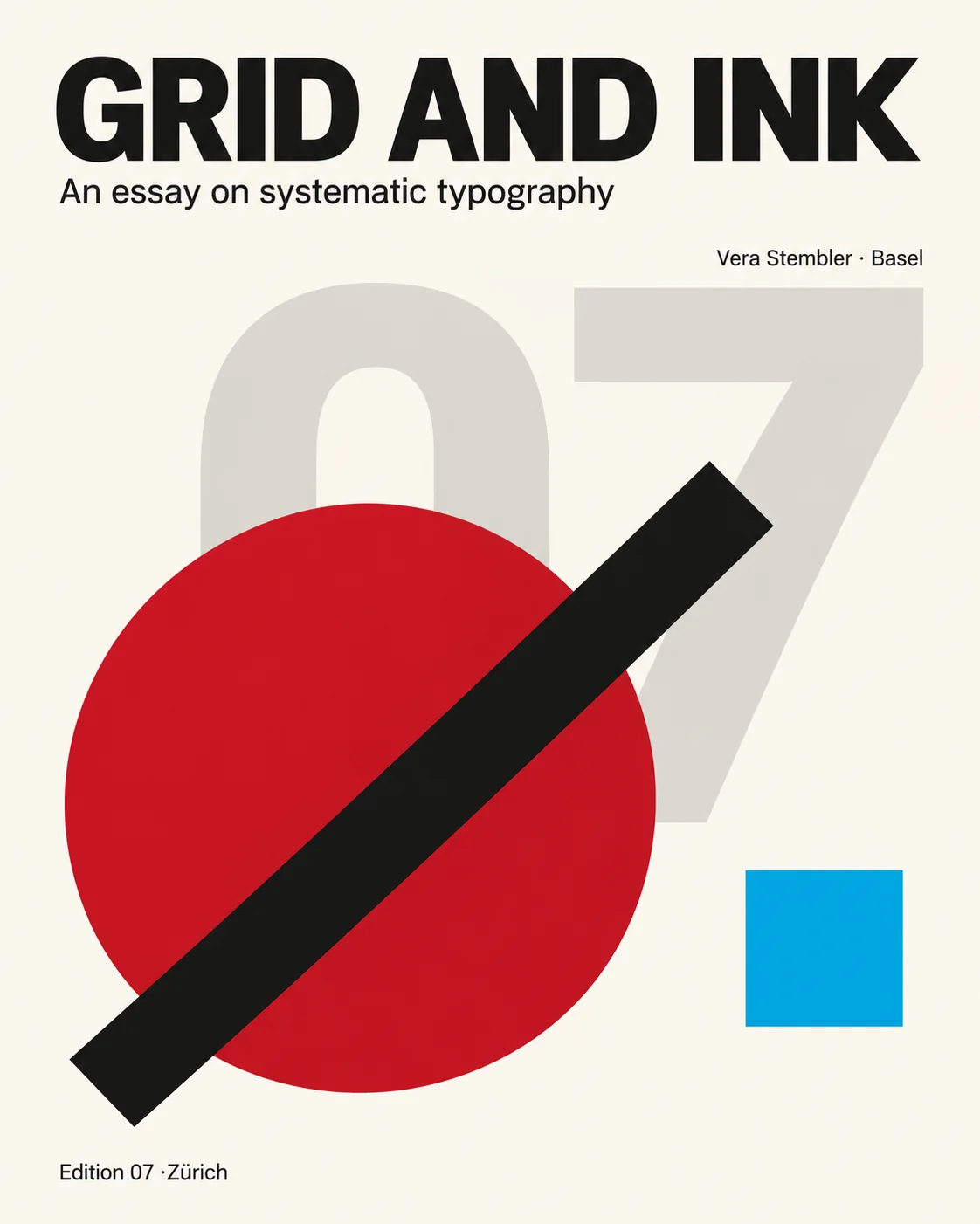
Create a 4:5 vertical Swiss International Typographic Style poster on a warm off-white paper ground. Subject: a single abstract geometric composition of a large crimson circle partially overlapped by a black diagonal bar and a small cyan square, arranged on a strict modular grid with generous empty space. Render exactly these five text items and no others, all correctly spelled and crisply legible: 1) a large bold grotesk headline at the top reading "GRID AND INK"; 2) a small line beneath it reading "An essay on systematic typography"; 3) a right-aligned caption block reading "Vera Stembler · Basel"; 4) a large oversized translucent grey numeral "07" behind the geometry as a background layer; 5) a single small caption at the bottom reading "Edition 07 ·Zürich". Left-align the type on a hard vertical axis with clean flush spacing, one type family, no more than two weights. Precise Swiss grid discipline, flat color, no gradients, no drop shadows, no photograph, no illustration of objects, no decorative texture. No other text, no logos, no page numbers, no watermark, no borders.
Why it works: the type constraints do the work — one family, two weights, one alignment axis. The oversized "07" sits behind the geometry as a specified background layer, so it reads as structure rather than a stray number.
Transit wayfinding signage
Signage is the hardest test of text accuracy because strings must survive perspective and repetition. Banning ads, route maps, and stray numbers is what keeps the render from filling with invented signage.
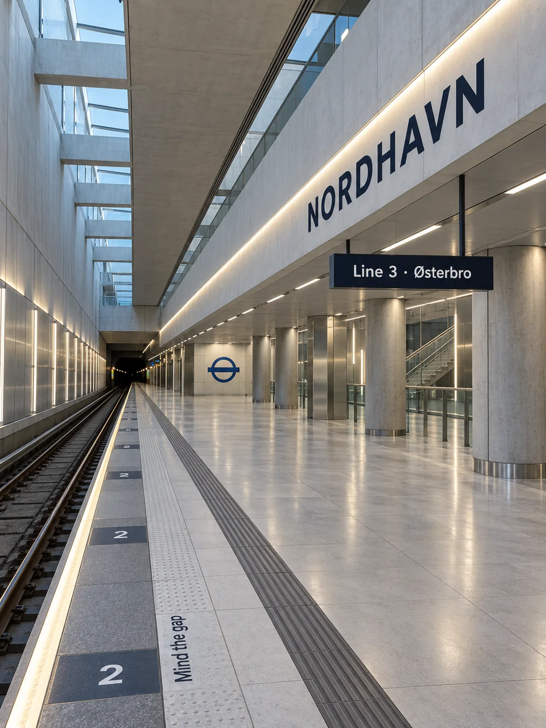
Create a 3:4 vertical photograph of a modern metro station platform at mid-morning, clean architectural photography, long converging perspective down the platform, pale concrete and brushed steel surfaces, an enameled white-and-blue roundel-style wall emblem with a simple geometric bar motif mounted at the platform end. Render exactly these four text items and no others, all correctly spelled and crisply legible: 1) a large station name sign across the upper wall reading "NORDHAVN"; 2) a hanging directional sign below it reading "Line 3 · Østerbro"; 3) a small platform number repeated on the platform floor edge tiles reading "2"; 4) a small safety notice near the platform edge reading "Mind the gap". Use modern grotesk sans-serif station type with consistent letter spacing; the station name should be the strongest visual element after the architecture. Cool daylight from skylights mixed with even fluorescent platform lighting, clean legible signage design, no people in the foreground, no advertising, no posters or paper notices. No other text, no logos, no watermarks, no route maps, no numbers beyond 2, no garbled signage.
Why it works: each string is bound to a physical fixture and a depth in the scene, and the platform number is explicitly allowed to repeat. Banning advertising, route maps, and extra numbers removes the model's usual filler.
Letterpress book cover
Book covers reward restraint: one ink color, a small illustration, and short classical strings. Keeping the copy minimal leaves room for the paper texture to carry the design.
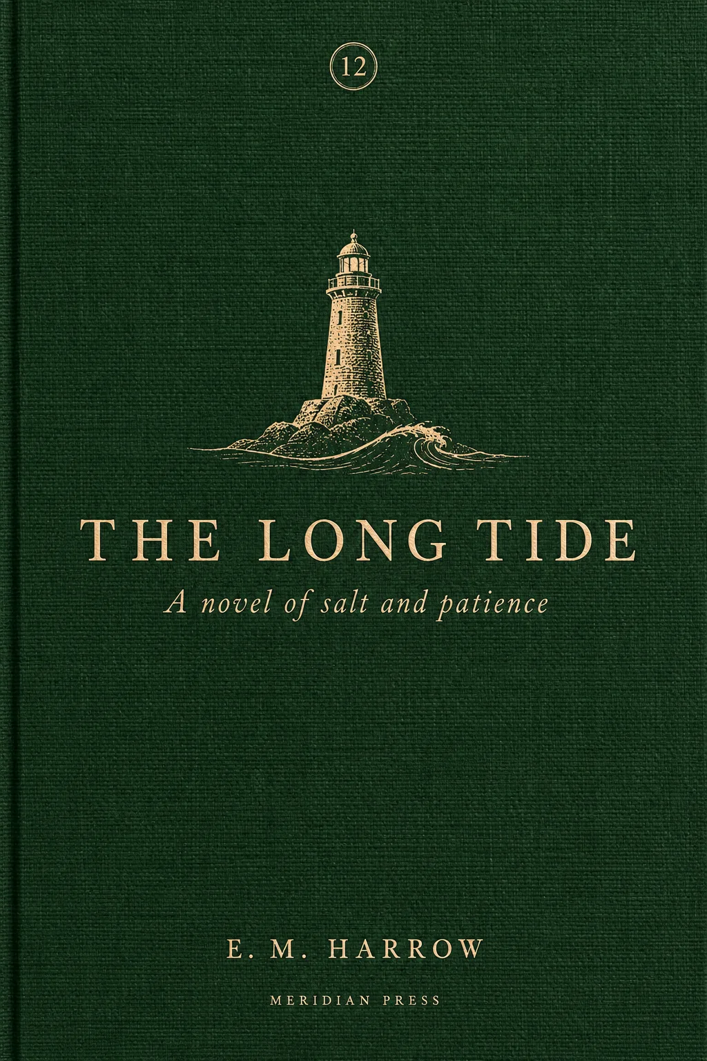
Create a 2:3 vertical literary book-cover design on a deep forest-green cloth-textured paper ground with a subtle cloth weave. Central image: a small letterpress-style illustration of a stone lighthouse above a single engraved wave line, printed in muted cream and dull gold ink, occupying the upper-middle third of the cover with generous empty space above and below. Render exactly these five text items and no others, all correctly spelled and crisply legible: 1) the main title in large elegant serif capitals reading "THE LONG TIDE"; 2) directly beneath it a smaller italic subtitle reading "A novel of salt and patience"; 3) the author name in small spaced capitals near the bottom reading "E. M. HARROW"; 4) a tiny publisher line at the very bottom reading "MERIDIAN PRESS"; 5) a small circular award-style emblem at the top containing only the number "12". Use one warm cream ink color for all type, restrained letterpress print texture with slight ink impression into the cloth, calm classic literary design, no gloss, no photograph, no 3D render. No other text, no logos, no barcode, no price, no blurbs, no watermark, no border frame.
Why it works: a single ink color and small spaced capitals for the author and publisher give a consistent typographic voice. Banning blurbs, barcodes, and prices removes the clutter models add to book covers by default.
A text-budget checklist
- Cap the copy. One to four short strings per poster; long paragraphs are where spelling fails first.
- Quote every string. Wrap exact copy in quotation marks and say “render exactly” — never paraphrase text you need on the canvas.
- Give each string a job. Assign position, typeface character, and scale instead of listing decorative fonts.
- Reserve space for type. Ask for negative space where the text lands (sky band, paper margin) so type never fights the scene.
- Close the door. End with “no other text,” then name the elements that usually appear anyway — logos, barcodes, sponsor boxes, watermarks.
- Proofread the output. Check every rendered string against the brief before using the image; regenerate rather than accepting near-spelling.
The prompts and posters here were created independently for PromptGenius. The directions were informed by Underwood's Akatsuki typography-ground poster, his typography-plaza ensemble key art, his festival key-art layout, XingchenAIArt's brand-cover frame, and DAAI's cultural-archive typographic hierarchy. For more display work, see the composition reference cards, the art styles and media collection, and the full GPT Image 2 set.
Related Articles & Guides
 #gpt-image-2
GPT Image 2 Anime Poster and Mecha Key Visual Prompts
Build anime posters, mecha key visuals, pixel sprite sheets, and game screenshots with GPT Image 2 using layout budgets and identity locks.
 #gpt-image-2
GPT Image 2 Character Sheet and Reference Prompts
Keep a recurring character consistent in GPT Image 2 with casting sheets, expression grids, pose studies, and reusable hair and wardrobe cards.
 #gpt-image-2
GPT Image 2 Art Style and Media Prompts
Explore original GPT Image 2 art prompts for paper collage, oil pastel, sumi-e ink, felted wool, palette-knife oil, and botanical watercolor, with reusable techniques.