GPT Image 2 Composition Reference Card Prompts
Generate four minimalist composition studies with GPT Image 2: visual core, diagonal momentum, enclosing axis, and sectional partition.
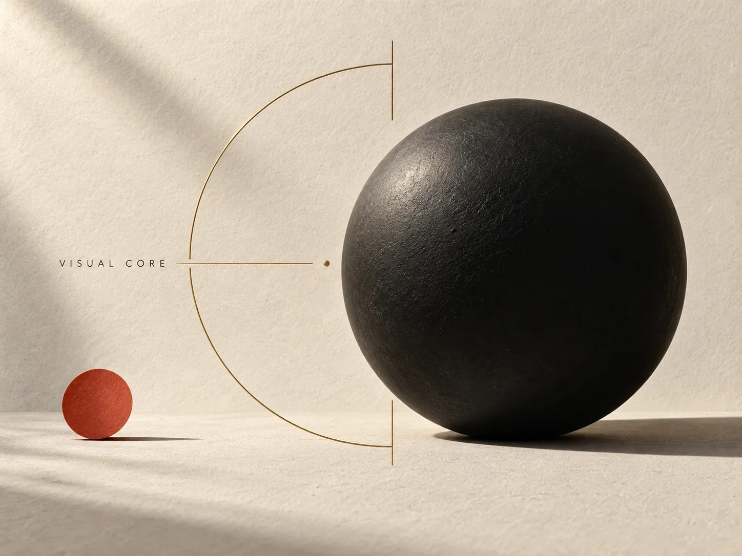
Use GPT Image 2 to create art-directed composition studies that explain one layout principle through sculptural forms, material, lighting, and visual weight. These are gallery-like reference plates rather than blank diagrams. Each example isolates one relationship so you can compare layouts without changing the subject matter.
The prompts share a consistent visual system—white ground, charcoal geometry, pale-gray guides, and minimal type. Change the geometry clause to explore another composition while keeping the presentation stable.
Four composition studies
Visual core
One dominant shape and one quiet accent establish hierarchy. The open frame points toward the focal mass without competing with it.
Create a premium graphic-design exhibition plate showing the composition principle VISUAL CORE. Format: 4:3 landscape. Use warm ivory uncoated paper with tactile grain, deep ink-black forms, muted vermilion, and soft brass accents. Make one monumental matte-black sculptural sphere dominate the right-center; balance it with one small vermilion disc low on the left and a thin open brass frame that points toward the sphere. Add elegant directional gallery light, subtle cast shadows, precise Swiss editorial spacing, and a refined small uppercase title “VISUAL CORE”. It should feel like a photographed page from a high-end design annual: art-directed, tactile, restrained but visually striking. No blank empty-card look, no app mockup, no extra text, no logos.
Diagonal momentum
A size progression makes the eye travel from the lower-left toward the upper-right. The line supports the direction; the changing scale gives the movement weight.
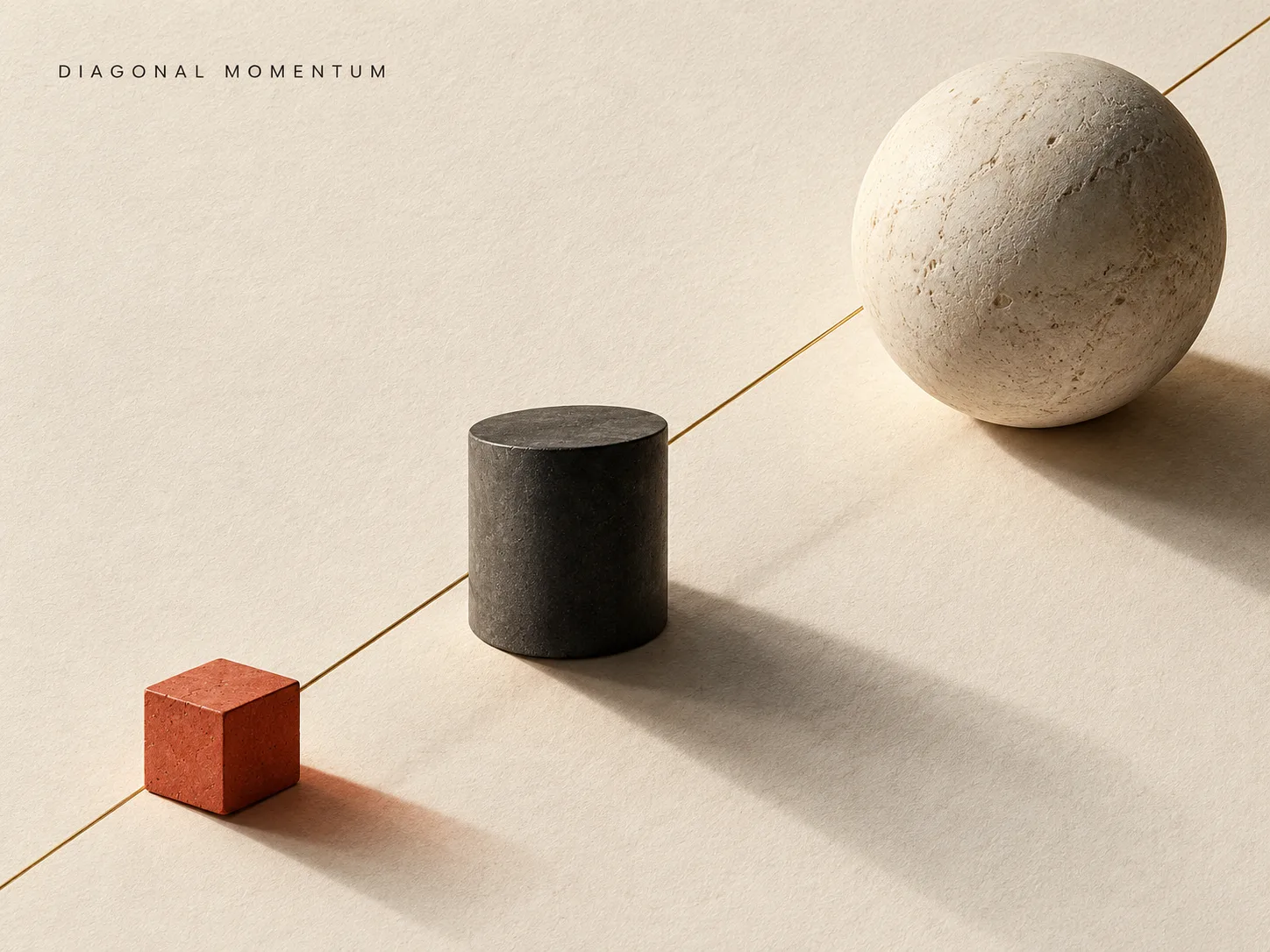
Create a minimalist graphic-design composition study card, 4:3 landscape. Topic: DIAGONAL MOMENTUM. White paper background, black type, pale-gray geometry, generous negative space, restrained Swiss editorial design. Build one strong diagonal path from the lower-left corner toward the upper-right: three charcoal forms increase in size and visual weight along the path, with a thin rule and one small circular accent reinforcing the direction. Keep the movement obvious at thumbnail size; no extra illustration or texture. Use only the exact title “DIAGONAL MOMENTUM” in small uppercase sans-serif type. No paragraphs, no extra labels, no logos, no mockup, no border. Flat printed study card, crisp alignment.
Enclosing axis
An incomplete arc contains a single focal square. The vertical line gives the shape a second alignment cue while leaving the circle open and light.
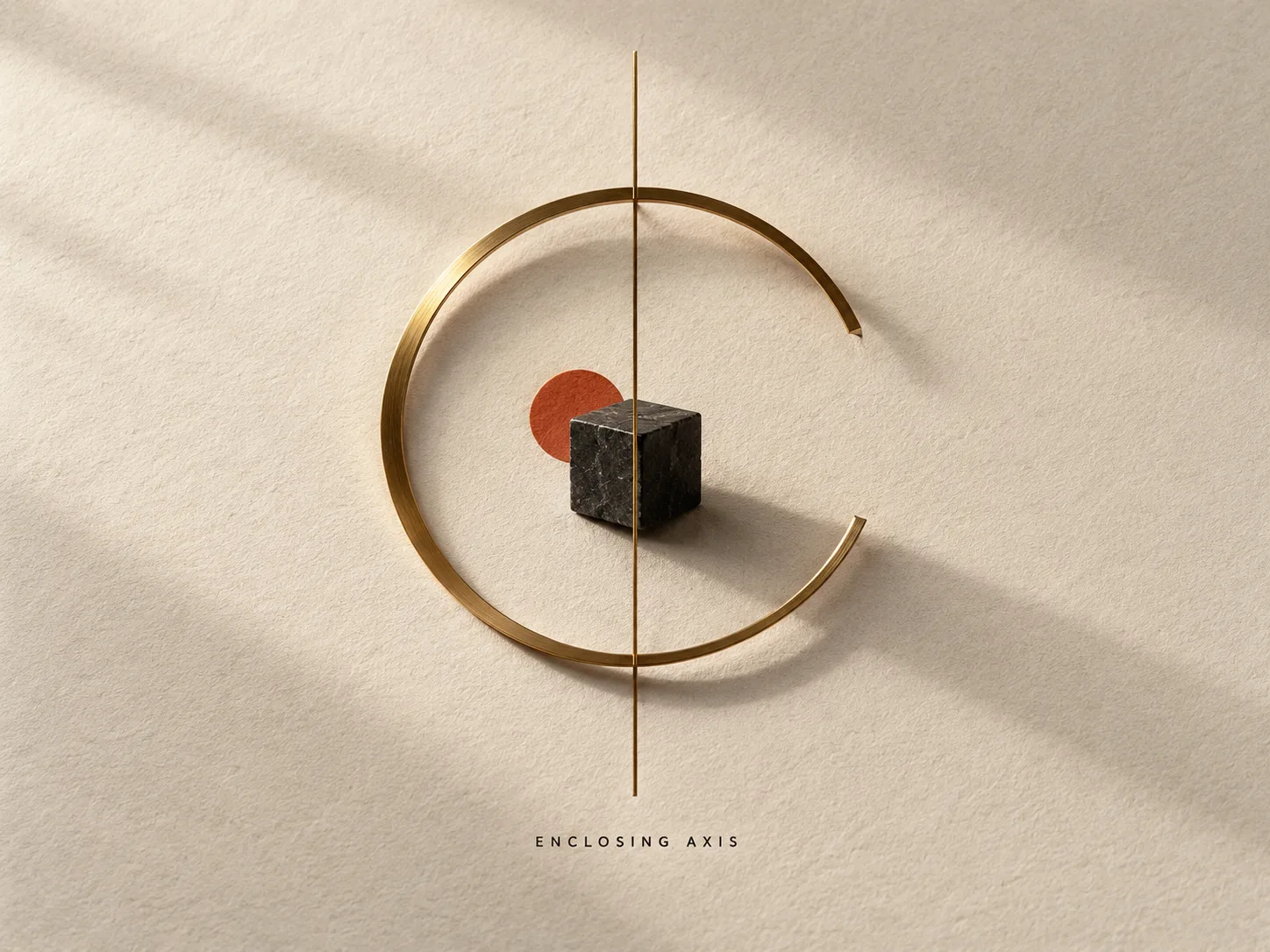
Create a 4:3 landscape design-exhibition plate for the composition principle ENCLOSING AXIS. Use warm ivory paper with tactile grain, deep ink-black, muted vermilion, and fine brass details. Center one small dark basalt cube inside a large incomplete brass ring; let a slim vertical brass line pass through the composition and align with the cube. Use strong negative space, sculptural depth, gallery-quality side light, and natural cast shadows so the enclosure feels intentional and the focal object remains dominant. Make it visually rich and tactile, not a flat worksheet. Set only the exact small uppercase title “ENCLOSING AXIS”. No extra text, no frame, no UI.
Sectional partition
Unequal widths and contrasting weights demonstrate how an asymmetrical grid divides attention. The small right-side accent balances the larger left mass without making the sections equal.
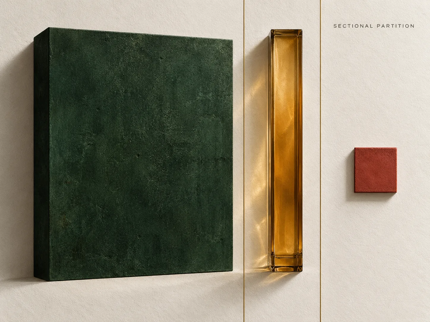
Create a 4:3 landscape design-exhibition plate for the composition principle SECTIONAL PARTITION. Use tactile warm-white paper, a deep forest-green panel, muted vermilion accent, charcoal ink, and soft brass dividers. Divide the canvas into three unequal vertical zones with two thin, elegant rules: a large dark green sculptural slab fills the left zone, a narrow translucent amber glass column occupies the center, and one small vermilion tile sits in the far-right zone. Use physical depth, directional gallery lighting, gentle shadows, refined typography, and confident negative space. The unequal proportions should make the partition idea immediate while the overall image feels like premium art direction, not a blank diagram. Add only the small exact uppercase title “SECTIONAL PARTITION”. No other copy, no UI, no frame.
A reusable layout recipe
For a new card, keep the shared style instructions and replace the topic with one specific relationship:
- Name the composition principle.
- Choose one dominant shape and one secondary shape.
- Describe their position, scale, and direction relative to each other.
- Limit labels to a short title so the diagram carries the meaning.
If the model adds decorative material, reduce the brief to fewer objects and state which shape should dominate. For an applied poster composition, see the travel-photo poster prompts.
This approach is informed by MrLarus’s composition-reference-card study. The prompts and example images here were created independently.
Related Articles & Guides
 #gpt-image-2
GPT Image 2 Prompts and Workflows
Explore original GPT Image 2 prompts with generated examples for posters, art styles, composition studies, interface mockups, infographics, and photorealism.
 #gpt-image-2
GPT Image 2 Infographic and Diagram Prompts
Build readable GPT Image 2 infographics with clear sequences, short labels, verified facts, and layouts that make relationships easy to scan.
 #gpt-image-2
GPT Image 2 UI Mockup Prompts
Create concept UI screens with GPT Image 2 using explicit layout, design tokens, concise labels, and consistent components.